Featured

12 Teacher Skills That Transfer to Tech

“If you want to teach people a new way of thinking, don’t bother trying to teach them. Instead, give them a tool, the use of which will lead to new ways of thinking.”


― Richard Buckminster Fuller

Some of my most eye-opening experiences as an educator came from the years where I trained a student teacher for a semester. As they began their stint by observing my lessons and preparations in their first few days, I inevitably became overwhelmed at the sheer volume – not to mention complexity and nuance – of skills they would need to master over the next several weeks. Skills that become so ingrained in an experienced teacher that they go unnoticed and unappreciated.

And with very few exceptions (like knowing how to quickly silence a group of 35 teenagers with merely a look), those skills transfer to the world outside of the classroom.

-1-

Teachers understand and embrace the learning process.
Technology is always evolving and requires its participants to be lifelong learners.

The technology that we have today will be obsolete tomorrow. As a result, tech not only needs people that have mastered a certain tool or process, but needs people that can be continuously learning and growing. Teachers have a leg up in this arena, since they are so skilled at recognizing – and navigating – the inherent struggles that arise when learning something new. Additionally, teachers operate with a growth mindset perspective, believing that effort and practice can lead to new skills.

-2-

Teachers are experts and sequencing and chunking complex topics in order to make them more understandable.
In technology, problems are solved by breaking them down into smaller problems and tackling them in a logical order.

As a teacher, I was tasked with taking a group of students from an elementary understanding of math to a mastery of algebra within a three-year period. I was successful because I knew how to group, organize and break up concepts so that they could be understood. Those same skills are used in tech, where small chunks of code can be assembled into a larger block or in presenting technological information to a non-tech audience, where you have to be deliberate in your approach.

-3-

Teachers are adept at all forms of communication.
In technology, you have to first listen to understand the problem and then be able to effectively communication the solution.

No field thrives without quality communication both within the business and with stakeholders and/or customers outside the industry. Teachers know how to communicate. Teachers are expert listeners because before you can teach a student, who have to first understand what they know and how they think. Teachers are often effective writers, as they craft everything from directions on a lab to an article for the school website. And of course, teachers excel at presentation since they prepare and deliver these multiple times a day.

-4-

Teachers are expert storytellers, using narrative and visuals to make their content come alive.
Technology often needs people that can synthesize multiple ideas and weave them into a cohesive presentation.

Information is useless if people can’t assimilate it. Whether because of a lack of background knowledge, misconceptions or cognitive biases, it is often a challenge to get people to understand difficult or technical concepts. Teachers know how to build from prior knowledge and use storytelling to uncover and address any previously help beliefs.

-5-

Teachers are nimble in their approach, flexibly trying different solutions until they find the one that works.
Within the tech world, it is also important not to become too wedded to one methodology; a problem-solving mindset is required.

Even though there are certain concepts that I taught every year for my entire career, I never taught them in the same way because the students were not the same. Every day in the classroom provides myriad opportunities for problem-solving and resourcefulness as you have to figure out a way to make it work. Tech is no different. Even if one language or tool is your favorite, it doesn’t mean that it’s the right one for this particular job.

-6-

Teachers are skilled at starting with a longterm goal and then planning backwards what steps are needed to reach that endpoint.
Technology is often trying to solve big problems and it needs people that can strategize how to incrementally reach that solution.

Tech rarely grows in leaps and bounds, rather it uses incremental improvement to increase efficiency or usefulness over time. Teachers are used to this methodology, using repeated observations and assessments to measure progress towards a larger goal.

-7-

Teachers become masters at error analysis, tracking down and addressing the root of a problem.
In technology, at least as much time is spent identifying and fixing problems as is spent on building new systems.

Scanning through lines of code looking for the bug is very similar to reading through lines of a student’s work looking for their error. And in both cases, identifying the error is only the first step. The more important part is understanding why it occurred and how to remediate the problem.

-8-

Teachers have to become comfortable and adept at improvising when things don’t go as planned.
In technology, it is critical to be able to figure out a new path when an obstacle arises.

Whether it’s an unplanned fire drill that cuts class time down to 10 minutes or the internet going down at the beginning of a technology-focused lesson, teachers have to be good at thinking on the fly. The tech world may have fewer unplanned fire drills, but the forced deviations from a plan are just as numerous. It’s helpful to have people around that can navigate those without frustration or overwhelm.

-9-

Teachers have tremendous experience in working with diverse groups of people that often have different perspectives and experiences.
Technology brings together people from all backgrounds and the best results come from teams that can effectively work together.

Teachers know how to collaborate, working together to achieve a goal and utilizing the talents that each person brings to the table. They are comfortable in diverse groups and skilled at guiding conversations that contain many different views and ideas.

-10-

Teachers are experts at both asking and using questions.
Technology is a tool that is at its best when it arises from great questions and never refrains from questioning its conclusions.

Contrary to how many people view teachers, they actually spend more time asking rather than telling: How do you know that? Why did that happen? What would happen if…? Questions like that are critical in tech, where it is all-too-easy to adopt a narrow focus that fails to challenge itself. Questioners improve both process and product.

-11-

Teachers are used to working with constant – and rigid – deadlines.
In tech, deadlines are critical as projects move through the pipeline.

When the bell rings, the teacher HAS to be ready. As a result, teachers are used to deadlines and don’t have a problem with having deliverables ready on time.

-12-

Teachers know how to inspire and motivate a group.
Every team can benefit from a voice that helps each individual become their best.

In a well-run classroom, every student is celebrated for their strengths and encouraged to build upon them to become better. Defeat is viewed as a temporary condition and those struggles are used to build strength. “I can’t” is replaced with “I can’t yet, but I’m getting there.” Who wouldn’t want that same energy in their team?

Teachers can teach.

And they can also do so much more.

Lesson of the Day

Other than guided exercises, I have not yet used map in Python (a combination of loving comprehensions and not taking the time to understand map). After reading through a brief tutorial on how map works, I’m now actively looking for opportunities to practice it.

Frustration of the Day

This is actually more of a sad than a frustration. A few conversations this week really ignited my teacher guilt about leaving. I just keep telling myself that they will be okay.

Win of the Day

I just received the pre-work material for my bootcamp program with the caveat that it may be difficult. I looked through it and nothing was unfamiliar. That would NOT have been the case a year ago!

Current Standing on the Imposter Syndrome Scale

3/5

You Can’t Have One Without the Other: The Importance of Considering Both Quantitative and Qualitative Data

“Data is a tool for enhancing intuition.”

Hilary Mason, Data Scientist

Learning to interpret data effectively was one of my first lessons as a teacher. I came into an established classroom in December when the existing teacher took a new role. As such, I inherited a gradebook already filled with scores for the 120 students that I was now responsible for.

Since I saw the data before I met the students, I poured over those grades, making notes of which students seemed to need extra support on certain concepts and which ones may need extra challenges. I was allowed access to the records room, where I searched through folders to find years of standardized test results.

Carefully cross-referencing all of these numbers against the state math standards, I came up with a plan of action for the classes as a whole and for certain students individually.

And then once I actually met the students, all those plans were thrown out the metaphorical window. Because the quantitative data that I had only gave a piece of the picture and I had been acting as through it was the entire truth.

Quantitative data alone tends to oversimplify a situation, reducing individuals to aggregates and trends.

In some ways, what I observed validated the quantitative data. Yes, student A did struggle with integers and needed extra support. But after getting to know that student, what they really needed was some belief in themselves that they could do math. They struggled with integers because they had shut down years earlier out of a fear of being seen as stupid. The assessments measured the outcome, but didn’t reveal the underlying cause.

And student B? The one who made a 90+ on every assessment? Well, they happened to be quite skilled at applying algorithms, but nothing had yet revealed their inability to navigate a novel problem. The assessments failed to ask the right questions, so the data were incomplete. The student didn’t need harder material, they needed different material.

The early data were not wrong, but following it blindly without consideration for qualitative factors would mean that the solutions wouldn’t address – or fix – the actual problem.

It can be tempting to put too much faith in pure quantitative data. After all, since it has to obey certain rules, it seems truthier than other types of information. It’s often relatively easy to parse and hard and fast rules can be written for decisions that arise from the data. There’s a comfort in the quantitative; by reducing things, we can feel like we can control our environments. But much like a model that is too simple fails to be useful, purely quantitative data can easily become meaningless if it fails to address the underlying “why?” behind a process.

Of course, it is also possible to err on the other side, to fall into the trap of only relying on qualitative data without taking any measurements. Without the quantitative, we cannot answer the questions of “By how much?” or “Is the difference significant?”

By working with student A on building their confidence and then revisiting integer concepts, I can have a sense that they have improved, but only an assessment (or, ideally, a series of different kinds of assessment) can show the progress and put it in a form that can be communicated, analyzed and tracked over time.

Qualitative data alone tends to over-emphasize certain factors and completely ignore others.

Qualitative data is very sensitive to bias and often difficult to summarize in a meaningful and useful way. Furthermore, the sample size for qualitative data tends to be much smaller (I can get the dollar amount that 10,000 customers spent with a company a whole lot easier than I can interview each one for their feelings about the company). And when that sample size approaches 1, data are replaced with anecdotes – maybe still useful, but not actionable on their own.

To be the most informative, we need to consider both types of data together. For example, think about a winter weather forecast – the actual temperature of 35o tells you that there shouldn’t be ice on the roads (good to know!) but the “feels like” forecast of 29o warns you to wear your heavier coat. Both data points convey information and, when taken together, give you a better understanding than one alone.

Lesson of the Day

I’ve been working my way through some business analytics courses and I learned about the three most important (at least according to this resource) customer summary metrics: recency, frequency and monetary value.

Frustration of the Day

I’m not doing well at the moment with the waiting aspect of job hunting. Patience isn’t my strongest suit.

Win of the Day

I unfollowed the “leaving teaching” groups that I was a part of on Facebook. I’ve outgrown them now. I’m looking forward.

Current Standing on the Imposter Syndrome Scale

?/5

Like the Alaskan weather – it changes by the minute!

From the Math Classroom to the Boardroom: Keys to Presenting Technical Information Effectively

Everything should be made as simple as possible, but not simpler.

Albert Einstein

Break Down the Goal

In my first year teaching, I wasn’t sure if I should laugh or cry at the entirely vague state standard of “Use linear functions.” I ended up doing neither and instead spent several hours brainstorming all of the concepts and skills that go into linear functions, grouping those into natural clusters and then labeling those with a key concept.

You have to know what you’re trying to accomplish in order to know what steps are needed to get there. In both environments, the goals are often large and take place over a long timeframe. Rather than becoming overwhelmed or jumping in without any plan, it’s important to be able to work backwards from that ultimate endpoint and find the intermediate goals within.

Sequence and Parse the Information

Going back to those linear functions, once I had my clusters of concepts, I then went though and decided what were my key ideas that were critical to convey and what were extensions or supporting details that could be eliminated if needed. Next, I had to sequence the concepts, making sure that they built upon each other in a natural flow.

Information of a technical nature has to be presented in a logical order with enough detail provided at the right time in order to promote understanding. In addition, it is critical to think ahead of time about the level of granularity needed for the situation at hand. There is always more information that can be included, but too much data waters down the concepts that you want to prioritize.

Understand the Audience

Some years when I taught linear functions, my audience was a group of students that had failed the math standardized test the previous year. They not only needed more scaffolding and repetition, I also had to overcome their negative experiences with math. Other years, I taught the same concepts to accelerated students who not only loved math, but could easily process new concepts and became frustrated with repetition.

The audience is just as critical in deciding how to present information as is the content. It is important to have empathy with the audience, to anticipate their motivations, understanding and needs. Presenting technical information is all about establishing a connection between the concepts and the people and in order to create that connection, you have to understand both.

Connect to the Audience

Let’s face it, the average middle schooler is way more interested in their fellow classmates than they are in y=mx+b. So, in order to increase engagement and motivation, I turned basic practice into slope speed dating (with all the proper ground rules established up front). Hilarious? Absolutely. Effective? Totally.

Now, obviously that strategy would not work elsewhere, but that’s exactly the point – the strategy should be tailored to the audience and their profiles and interests. Instead of jumping straight into the big picture details, look for ways to start with something that the audience can relate to. Once they’re hooked, it’s much easier to get them to buy in to the rest.

Manage Pain Points

Whether 14 or 40, nobody likes to be wrong and nobody likes to feel stupid. And when you’re dealing with conveying complex information, it’s important to be prepared for both of those eventualities.

If you know ahead of time what some of the misconceptions are, you can address them up front, “While it may seem that…, the data actually suggest…” and then back that up with a great visualization. Even better, take the audience on a journey of discovery, “When I first started with this data, I expected to find (misconception), but what I actually found was really surprising!” Then, follow this with the surprise and then into the conclusions. When we’re curious and our observations have been validated, our minds are open and we are less likely to be defensive.

Provide Opportunities for the Audience to Feel Smart

I used to design discovery-based math labs to maximize the excitement of the “ah-ha” moments. When done well, learners are unaware of how much they have been led to a certain conclusion, they just focus on the accomplishment they feel for reaching it.

Ask questions – even hypothetical ones – and create a sense of ownership in the process in order to promote engagement and make the audience feel like they are a critical component in making sense of the information.

In addition, it is important to find the balance between building confidence in the audience about your expertise and throwing in material that is over the group’s head just to make yourself look smart.

Watch Out for False Conclusions

I have a little challenge for you. Imagine a multiple choice math test where the test-taker has no idea about a particular question. Which of the following answers will they likely select?

A. 8

B. -5

C. -7.1987

D. 1/2

Most of them will lean towards C because it’s the most complicated and there is often a false belief that complicated = more correct.

There’s another type of incorrect conclusion to watch out for – the human tendency to assign meaning to patterns. The confusion between correlation and causation is widespread and so it’s critical to address any spurious correlations in your information head on with either counterpoints or additional data.

Have Ways to Measure Progress

I always coached my students to view quizzes as information. They are a snapshot in time and the score matters less than what you do with that data. The score allows insight into trends (are they improving over time or getting worse), highlights areas that need attention and, just as importantly, shows what things can be safely set aside.

From the formal KPIs and success metrics to the observational information provided by the inefficient approaches of a confused group, it is critical for your audience to know where things stand. After all, if you don’t know how you’re doing, how can you know what you need to do next?

Present Concisely and Clearly

Confession time. Whenever I’m taking an online course and I come to a video or slideshow, the first thing I do is check to see how long it is. And then, when I’m finished with the material, I decide how long it should have been. And sadly, there is often a disconnect, with extraneous information, poor pacing or pointless repetition slowing down the learning process, impeding comprehension and negatively impacting motivation.

Make sure that everything in your delivery has a purpose (and remember that a hook or connection to the audience is purposeful). Aim to show or illustrate points instead of telling them whenever possible because visuals are often easier to understand than a description. Look for the most straightforward way to show or write something and then make any additional information available for those that are interested.

Have Structure and Surprise

A student once said about my class, “We always know what to expect, but we never know what we’ll be doing.”

It’s important to strike a balance between a predefined and well-marked path and exploration. If you err too far on the side of structure, the audience tunes out because they feel like they know exactly what is coming on the next slide. On the other extreme, you may have everyone’s attention, but it will feel a bit like herding cats because the pathway isn’t clear. In the middle is a space where people are curious about the next point while still remaining clear on the overall trajectory.

Address “So What?”

Let’s go all the way back to those linear functions we started with. Before I ever taught my first lesson on the topic, I had to answer the question of, “Why do we need to know this?” for myself (and just being a state standard was not reason enough). By understanding the “why,” I could connect everything we did towards that goal and keep from being distracted by (sometimes really cool) ideas that didn’t address the reason for learning the concepts.

It’s no different in business. Even when the “why” is not explicitly stated, it needs to be the undercurrent beneath every data decision and every presentation. No matter how fancy the statistics or how amazing the dashboard, if it leaves people saying “So what?”, it’s worthless.

Make the Key Points Memorable

In the classroom, I used stories to help students retain key information. They all remember the linear-function-based story of the tortoise and the hare and how the fox time-traveled, resulting in a vertical ([fo]x = ) line. Stories of a man I saw at the gym attempting squats on an exercise ball remind them what happens when you try to divide by zero (nothing good).

We remember best when information is surrounded by a narrative because it engages more of the brain and gives a place for the new information to anchor. However, it is also important to be cognizant that this can also backfire when the story that is created around the information leads to some false conclusions.

Lesson of the Day

I did some more work with Pyspark and found it better this time around. But it still makes me miss Pandas:)

Frustration of the Day

It’s a struggle to find free tutorials on AWS that don’t feel more like a sales pitch than a lesson.

Win of the Day

Still trusting the process:)

Current Standing on the Imposter Syndrome Scale

2/5

I got this!

The Data Don’t Always Say What You Want to Hear: The Role of Cognitive Bias in Data Analysis

If there’s something you really want to believe, that’s what you should question the most.

Penn Jillette

It was 6th grade. I was sitting in the back of a (boring) language arts class when the boy seated next to me – a boy that I’d had a crush on for the entire semester – turned my direction and mouthed the words,

“I love you.”

At least, that’s what I thought he voicelessly said to me. It was only after he started laughing that I realized that he had instead mouthed the phrase, “Elephant shoes,” which for some reason wasn’t quite as exciting.

That same sort of miscommunication can happen when we “talk” to data. We go in with our own expectations and our own cognitive biases that sometimes make it hard for us to get out of our own way and listen to what the data have to say.

While the complete list of cognitive biases is both eye-opening and a bit frightening (I can’t actually be that irrational, can I???), the following are the main ones that I come across when working with – and talking about – data:

Confirmation Bias

We see what we expect to see and we’re more apt to go looking for support that we’re right than proof that we’re wrong.

Let’s say that you have a hypothesis that housing prices in your area have increased over the past six months. You download the data and start to do some exploratory analysis.

“Ah ha!” you think, “I was right!” as you notice that the mean sales price has indeed steadily risen. Doing your due diligence, you also check the median price, which has a decidedly downward trend. The natural instinct is to then justify a reason why the statistic that validates your expectation is correct, while the other one is obviously in error.

As a data professional (or, one could argue, as a thinking human being), it is okay (and often required) to begin with some ideas or hopes for what you may find. Yet, it is critical to keep an open and curious mind.

Instead of telling the data what you want to hear, ask the data what it has to say.

In the housing example, rather than discard the median as some sort of fluke, the next step would be to dig deeper to figure out why those trends are moving in opposite directions.

Not only do we have to be on lookout for confirmation bias in ourselves, we also have to be aware of its power when presenting data findings to others when the information may be in opposition to their previously-held beliefs. Without careful presentation, it’s easy for others to become defensive of their position and accuse the data – or you – of being wrong.

In order to make an audience receptive, it’s important to deliver the information in a manner that both protects the ego AND ignites curiosity. With the housing example, you could start by finding out what their expectations are (that prices are rising or falling) and then follow up with “You’re right AND…” while displaying a graphic showing the trends of both the mean and median prices. “How could both of these trends be true at the same time? Here’s what I found…”

Sunk Cost Fallacy

I found myself starting to fall into this one in one of my projects. I started out with the intention of using regression to predict a continuous metric to measure YouTube impact (comprised of watch time and number of views).

For a full week, I prepared the data for modeling. This required wrangling with persnickety APIs and carefully cleaning the text data before joining the related tables. This was following by carefully looking through each feature, deciding how to handle unusual values and engineering new features based on what I had. Next, I wrote and applied functions to split and prepare the data using three different methods: bag of words, TF-IDF and word-to-vector. Throughout, I kept realizing that I hadn’t cleaned the text quite well enough, and so I would go back and add a little more regex to my laundering functions.

Finally, it was time to model.

And the results were … less than stellar.

Actually, that’s a lie.

They were horrible. No matter what combination of regressor and text preparation I tried, the coefficient of determination was low and the error was high. Even the neural networks threw up their hands in defeat.

But I didn’t listen. You see, I had put SO much time and energy into the plan, that I wasn’t willing to throw it away.

The sunk cost fallacy describes our tendencies to stick with something that we have invested time, money or energy into even when there is a cost to holding on that outweighs the benefits. It’s called “sunk” cost because we’ve already invested our resources. I also like to think that “sunk” refers to the fact that we’re tied to our investments like an anchor that can often weigh us down.

There’s always a cost to holding on. And sometimes to have to let go of one thing in order to reach for something better.

One of the important skills to have when working with data is to know when it’s time to walk away from one approach. No matter how long you took getting there.

Oh, and on that project? Once I pivoted to classification, it worked out beautifully.

Action Bias

Pick up any research journal and do a quick scan of the abstracts. I expect that you would find very few papers that did not find a significant effect. Does this mean that most research hypothesis go on to be validated? Of course not. What you’re seeing is a version of the action bias.

It’s not very exciting to do a bunch of work and then exclaim, “Eureka! I found nothing!” But that’s (most) often the case. Usually all of that work results in no action apart from a closed file and the knowledge not to try that approach again.

The action bias reflects the human desire for forward progress. Think about being stuck in stop-and-go traffic for an hour or driving an hour out of your way, but on empty roads. Most of us would choose the latter option, because at least it feel like we’re doing something.

Action bestows a feeling of influence. Of power. Of purpose.

This is why it’s important to present actionable items alongside any dead ends. So our A/B testing showed that the current “buy now” button is better? Cool. So we don’t take action there, but maybe we test out a new header image. That way it’s reframed as a change in direction, rather than a halt to the action.

IKEA Effect

Which would you place more value on? A mass-produced chair that you painstakingly assembled from the box in which it arrived, or that same chair – brand new but already put together – offered to you for a price?

When we build it, we appreciate it.

In the data world, this shows up when the data professional spends so much time in the data that they forget to open the blinds and peak out into the world occasionally. They spend weeks or months working on a project. The analysis is insightful, the results significant and the models score the machine learning equivalent of an A+ on their tests. They develop a sense of ownership of the project and feel pride in their efforts. Efforts that they are sure anyone else would appreciate just as much.

“Look what I found!” they exclaim, running into the boardroom. “See this? It’s amazing! This will transform the business!”

But the reaction is lukewarm. Even if the proposed solution addresses the business problem, a finished product is never going to have the same value as one that you painstakingly built by hand. And that’s important to keep in mind – your job is to make it work and to make it easy to understand, not to get people to empathize with the process of getting there.

Back to the mass-market chair. To an outside observer, once assembled (assuming you know your way around a hex wrench), the seat you built is no different than the one purchased ready-made.

Hindsight Bias

When we look back now, we can easily see the factors that contributed to the housing collapse in 2008. They seem so obvious, these threads directly leading towards this singular outcome. So, we shake our heads at the people in the past wondering how they didn’t predict this particular outcome.

If you’re too certain, you’re likely either wrong or looking backwards.

The problem comes in when we inflate our ability to make predictions (real predictions, like in the future) because we are such rockstars at Monday-morning quarterbacking what has already happened.

Part of the reason that things like to 2008 housing crash happen is because people are TOO confident in their forecasts. It just happens that they were putting their faith in the wrong ones.

I think this may actually be a positive outcome of Covid – we’re all learning to become a bit more comfortable with uncertainty.

No matter how much we try to eliminate them, we will always have cognitive biases. Therefore, it’s important to learn how to recognize them and challenge the conclusions they erroneously lead us towards. Sometimes, we just need to get out of own way and listen to what the data are trying to tell us.

Lesson of the Day

I really hate self-promotion. But since I’m unlikely to get a job without telling/showing people what I can do, I’m having to learn to get over my discomfort and get better at it.

Frustration of the Day

Not a fan of Tableau Public. The versions keep changing and my saved work keeps disappearing.

Win of the Day

I’m trusting the process:)

Current Standing on the Imposter Syndrome Scale

2/5

I got this!

Should I Stay or Should I Go Now? Using A/B Testing to Assess Proposed Change

“If you never try, you’ll never know.”

The Situation

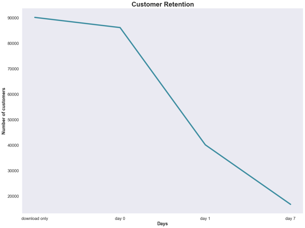
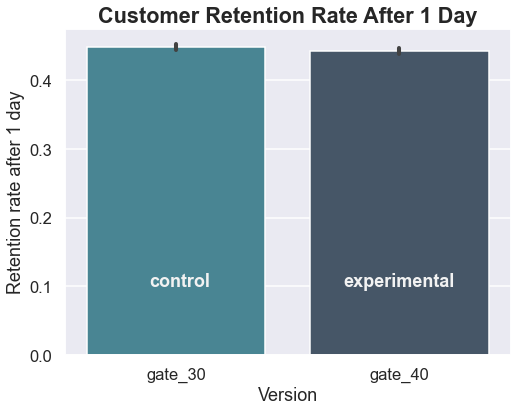
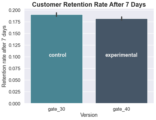
The developer of a phone-based game is concerned about the retention rate of customers who download the game after they saw this graphic in a company presentation.

The developer was especially concerned about the customers that churned after the first day. This indicated that they were interested enough in the game’s concept to try it out, but that something in the game failed to meet their expectations.

Hypothesizing that the beginning of the game was too easy, thus failing to keep the players’ attention, the developer proposed an A/B test where customers would be randomly selected to either begin the game at gate 30 (the previous starting point) or the more difficult gate 40 (the new starting point).

A test is set up and the data are collected.

Examining the Data

Data were collected from 90,189 customers that downloaded the game.

df = pd.read_csv('cookie_cats.csv')
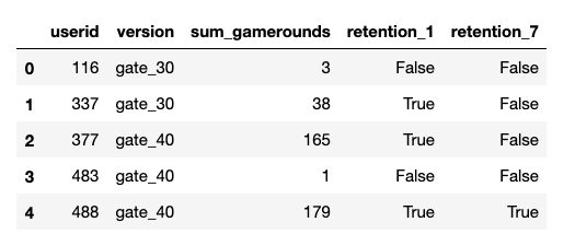
df.head()

Along with the A/B version and the retention at day 1 and 7, the total number of games played by the customer within the 7-day period was also collected.

(df['sum_gamerounds'] == 0).sum()
3994

There were 3,994 players that downloaded the game and did not play.

Before any further analysis is done, it makes sense to check for any unusual values.

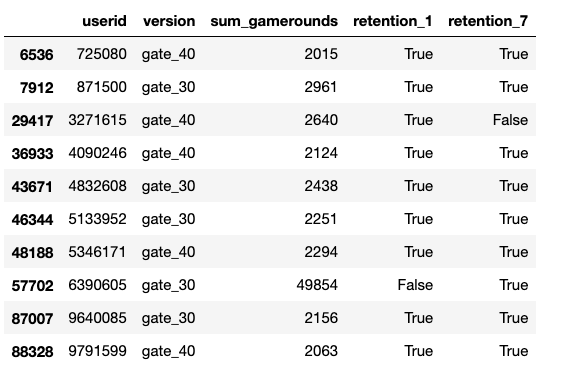
df[df['sum_gamerounds']>2000]

Wow! According to this, user #6390605 managed to play 49,854 games in a week! While that may technically be possible, it certainly appears to be an error, especially since the next highest value is 2,961. I will go ahead and remove this value before doing any other analysis.

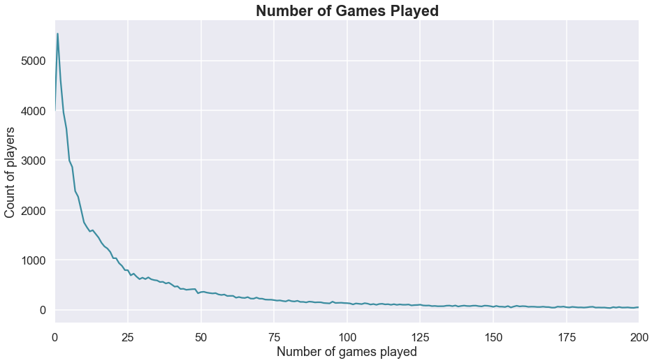
#Looking at the distribution of players who completed 200 or fewer games
fig,ax = plt.subplots(figsize=(15,8))
df.groupby('sum_gamerounds')['userid'].count().plot(color=NEUTRAL)
plt.xlabel('Number of games played')
plt.ylabel('Count of players')
plt.title('Number of Games Played', fontweight='bold', size='large')
plt.xlim(0,200);

Before running the statistical tests, it also makes sense to check the retention values.

x = ['download only', 'day 0', 'day 1', 'day 7']
y1 = (
    [control.shape[0], 
     (control['sum_gamerounds'] != 0).sum(), 
     control['retention_1'].sum(),
     control['retention_7'].sum()]
)
y2 = (
    [exp.shape[0], 
     (exp['sum_gamerounds'] != 0).sum(), 
     exp['retention_1'].sum(),
     exp['retention_7'].sum()]
)

fig,ax = plt.subplots(figsize=(20,15))
plt.plot(x,y1, color=NEUTRAL, linewidth=5, label='control')
plt.plot(x,y2, color=DARK_GRAY, linewidth=5, label='experimental')
plt.xlabel('Days', fontweight='bold')
plt.ylabel('Number of customers', fontweight='bold')
plt.title(
    'Customer Retention A/B Test', 
    fontsize='x-large', 
    fontweight='bold'
)
plt.grid(False)
plt.legend();

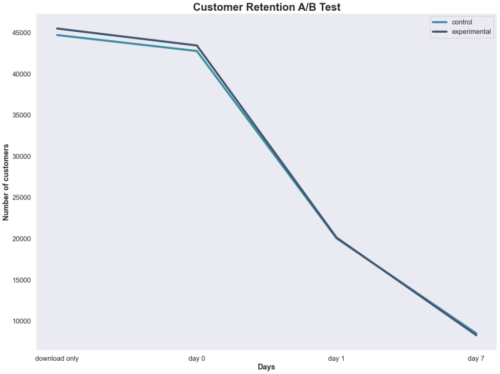
Well, that’s not looking promising for the developer’s hypothesis that changing the initial gate from 30 to 40 would increase retention. But let’s make sure using some statistical testing.

Setting the Hypotheses

The developer’s hypothesis is that the new version (gate 40) will perform better than the previous version (gate 30) on retaining customers at the 7-day mark. This leads to a one-tailed test where:

H0: gate_40 <= gate_30

or gate_40 – gate_30 <= 0

HA: gate_40 > gate_30

or gate_40 – gate_30 > 0

The confidence level will be set at 0.05.

Only the proportions of customers retained at the 7-day point will be considered.

Testing the Hypothesis

#Get a series for the retention values at day 7 for the control and
#experimental groups
control_results = df[df['version'] == 'gate_30']['retention_7']
exp_results = df[df['version'] == 'gate_40']['retention_7']

#Get the number of observations in each group
n_con = control_results.count()
n_exp = exp_results.count()

#The successes are the number of true values
successes = [control_results.sum(), exp_results.sum()]
nobs = [n_con, n_treat]

#Perform a one-tailed z-test using the proportions
z_stat, pval = proportions_ztest(successes, nobs=nobs, alternative='larger')
(lower_con, lower_exp), (upper_con, upper_exp) = proportion_confint(
    successes, 
    nobs=nobs, 
    alpha=0.05
)

print(f'z statistic: {z_stat:.2f}')
print(f'p-value: {1-pval:.3f}')
print(f'ci 95% for control group: [{lower_con:.3f}, {upper_con:.3f}]')
print(f'ci 95% for experimental group: [{lower_exp:.3f}, {upper_exp:.3f}]')

z statistic: 3.16
p-value: 0.999
ci 95% for control group: [0.187, 0.194]
ci 95% for treatment group: [0.178, 0.186]

The p-value is (much!) greater than the critical value of 0.05, which means we fail to reject the null hypothesis that the retention rate for gate 40 is less than or equal to that of gate 30. The confidence intervals do not overlap and show that gate 30 has a higher retention rate.

To be even more confident in this conclusion, bootstrapping can be performed. Bootstrapping using random sampling with replacement to simulate repeated experiments. In this case, 10,000 simulated experiments will be performed with the data.

#Using bootstrapping to sample the data

differences = []
control_results = []
exp_results = []
size = df.shape[0]

for i in range(10_000):
    sample = df.sample(size, replace=True)
    results = sample.groupby('version')['retention_7'].value_counts()
    control_ctr = results['gate_30'][True]/results['gate_30'].sum()
    exp_ctr = results['gate_40'][True]/results['gate_40'].sum()
    control_results.append(control_ctr)
    exp_results.append(results['gate_40'][True].sum())
    differences.append(exp_ctr - control_ctr)

fig,ax = plt.subplots(figsize=(15,8))
sns.kdeplot(control_results, label = 'control', color=DARK_GRAY)
sns.kdeplot(exp_results, c=NEUTRAL, label='experimental')
plt.title(
    'Distributions of Control and Experimental Samples', 
    fontweight='bold', 
    fontsize='large'
)
plt.legend();

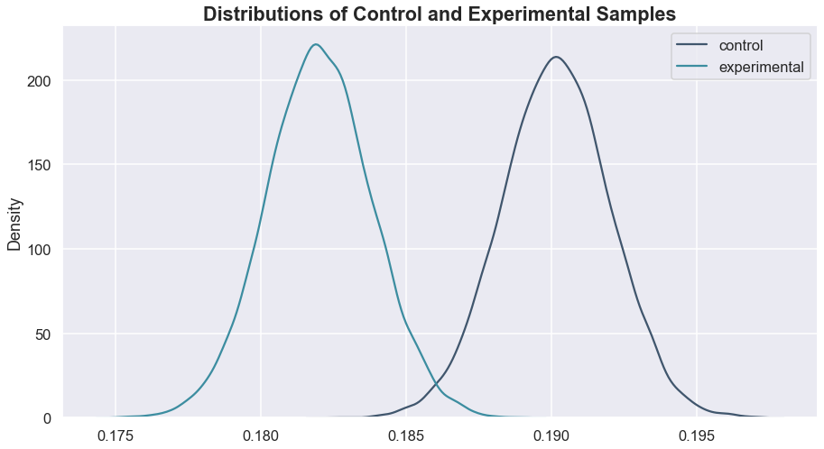
Looking at that, it is apparent that changing the gate to 40 is not a good idea, as almost the entire experimental distribution is below the control, indicating a lower retention at the 7-day point.

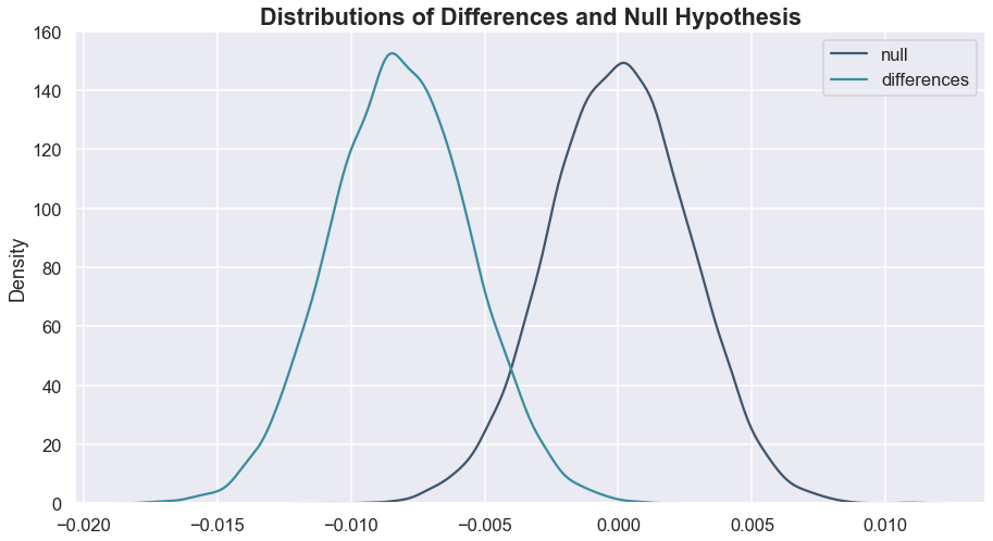
Another way that we can look at this is to compare the differences (gate 40 – gate 30) from the bootstrapped samples against a null distribution centered at 0 (this would be the most extreme case in the null hypothesis stated above).

Remember, we’re testing to see if the differences are larger than 0. This doesn’t look very promising at all.

Again, using statsmodels:

pval = ztest(differences, null_hypothesis, alternative='larger') 

pval
1.0

Based on the p-value and the graphs, we can be confident in our conclusion that gate 40 will not result in a higher retention rate at day-7 than gate 30.

Trying a Different Approach

When faced with the disappointing conclusion, the game developer had one more idea – “Maybe the retention isn’t better, but perhaps the gate change impacted how many games customers completed.”

This time, we’ll use a two-tailed test, not assuming the direction of any difference, with a null hypothesis that the two versions have the same number of games played.

#bootstrapping again for the number of rounds
control_results_rounds = []
exp_results_rounds = []
size_rounds = df.shape[0]

for i in range(10_000):
    sample_rounds = df.sample(size_rounds, replace=True)
    results_rounds = sample_rounds.groupby('version')['sum_gamerounds'].mean()
    control_rounds = results['gate_30']
    exp_rounds = results['gate_40']
    control_results_rounds.append(control_rounds)
    exp_results_rounds.append(exp_rounds)

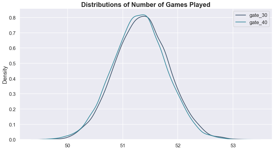
Both the visualization and the p-value confirm that we cannot determine that the gate change led to a difference in the number of games played.

Conclusion & Recommendations

The company should not make the change to starting at gate 40, as this led to a decrease in retention at the 7-day point. In fact, they may want to experiment with a change that makes the beginning of the game slightly easier rather than harder since gate 30 led to a better retention rate.

Based on the number of games played, it seems that the starting gate influences how likely someone is to stick with the game over the long-term, but does not impact the frequency that they play.

Lesson of the Day

I learned about the validation argument in pandas when merging dataframes. Pretty cool and a reminder to look for solutions like this before making things harder on myself.

Frustration of the Day

Job hunting is rough, y’all.

Win of the Day

Major compliment from the bootcamp I just graduated from. I’m going to keep that one close to me right now.

Current Standing on the Imposter Syndrome Scale

1-5/5

Depends on the hour.

What a Difference a Year Can Make

“If you want to experience significant progress toward your goal, you need to be intentional about the work you’re doing every day.”

Anonymous

I keep a daily 5-year spiral journal, where each day I am able to see my entries on that same day for the past few years.

After a frustrating afternoon a few weeks ago trying to do some time series analysis, I opened up that journal. I was at a low point emotionally. My SARIMA models were basically shrugging their shoulders at the natural price data I was feeding in, predicting very unhelpful prices of anywhere from $1.00 to $14.00. I was hopeful that deep learning algorithms would hold the clue to unlocking the patterns within the numbers, but they seemed to be failing too.

And I internalized that feeling, getting down on myself thinking that I didn’t know what I was doing.

And then I opened the journal and read what I had written a year prior –

“I finally understand how to use .apply() and lambda functions!”

And I had to laugh. First, at the me of a year ago who was SO excited over what now seems like breathing. And then I laughed again at my present self with the negative self-talk. After all, I wasn’t struggling on that present day because I didn’t know what I was doing; I was struggling because I wanted patterns in the data that simply were not present.

Several weeks ago, my instructor told me to start calling myself an “unemployed data scientist.” I started practicing those words, but it still felt fake.

Two night ago, I went to a gathering where I met some new people. Without thinking, I introduced myself as a data scientist and started talking excitedly about some of the projects I’ve been doing. It now feels real.

I AM a data scientist.

I get excited when I first start to explore a new dataset and I start to clean the data almost automatically.

I feel a deep satisfaction when I create a particularly effective data visualization.

I question records or features that seem erroneous and carefully consider their impact on summary statistics.

I dream about code and do SQL queries to relax.

I get frustrated with YouTube videos and Medium articles when I can tell the creator doesn’t know what they’re talking about.

I don’t trust the predictions of a machine learning model until I’ve checked its evaluation metrics and reduced any overfitting.

I’ve found that Python, Pandas SKLearn and SQL syntax has started to enter my non-technical writing (IS NOT NULL even made it onto a grocery list).

I personify my models and empathize when they’re struggling with difficult data.

With every presentation, every project, every conversation and every challenge, I’m feeling more and more at home with the title.

I AM a data scientist.

Lesson of the Day

It’s so important to have a goal and a plan, but also a flexible approach when the initial plan doesn’t work.

Frustration of the Day

In my capstone project, I was hoping to use regression, but had to switch to classification (see above) because of the data.

Win of the Day

The information that I’m getting from my capstone project (data about my other blog and YouTube channel) is already helping me make better decisions about content.

Current Standing on the Imposter Syndrome Scale

2/5

I’m starting to see in myself what others see in me. This will probably change next week once I start to build a dashboard (CSS terrifies me!).

Who Buys the Wine? Using Clustering for Market Segmentation

A satisfied customer is the best business strategy of all.

Michael LeBoeuf

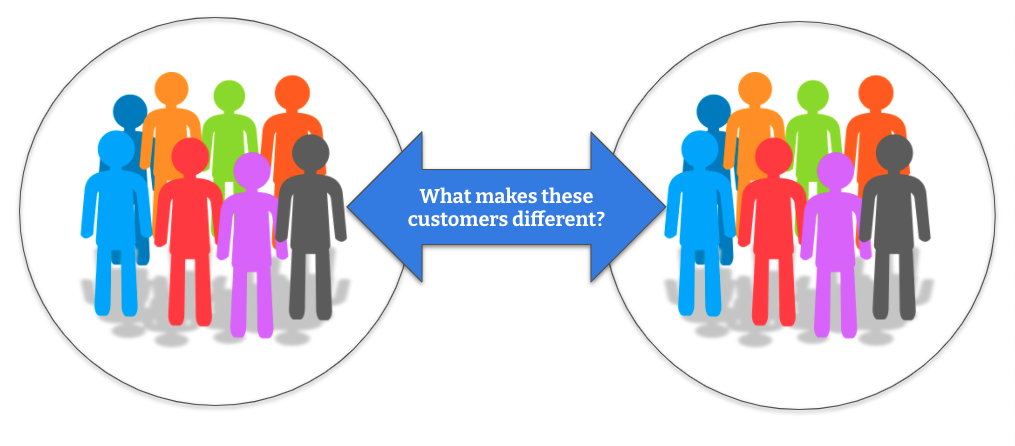
In order for retailers to maximize customer satisfaction, they first have to understand those customers. Since companies may have thousands, hundreds of thousands or even millions of customers, that often comes down to dividing customers into related groups and then working to understand the motivations and behaviors of a particular group.

The dataset that I’m working with has 2,240 observations from a company that sells food, wine and gold products through a storefront, catalog and website. Each record contains information about a single customer and has basic demographic information along with data about what they have purchased from the company and where the transactions occured.

My goal is to use KMeans, an unsupervised machine learning model that uses “distances” between features, to group the customers into like-behavior clusters and then analyze the data to make recommendations to the company to increase their sales.

This data isn’t too messy, but it still needs a little polish and a little pruning before getting down to business. First, I dropped the 24 rows that were missing data from the ‘Income’ column. I could have decided to impute these with the median income, but that risks creating misleading information and the deletion of the rows only results in a loss of about 1% of the obeservations.

Next, I looked at the “YearBirth” column. This was my first indication that either customers may not have been honest when submitting their demographic information or that there were some errors in data entry since there were three customers that were 115 or older, based upon their birth year! I went ahead and replaced this column with each customer’s approximate age and removed the three centenarians.

There were some shenanigans in the marital status column as well. Although the majority of customers fall into the expected categories of married, together, single and divorced, there are also four shoppers that classify their relationships as “YOLO” or “Absurd.” No judgment on how they want to live their lives, but those categories are difficult to interpret here. The “Education” column wasn’t quite as entertaining, but it also had values that were difficult to interpret.

I decided to drop the three categorical columns (ID, marital status and education) before using the model. The first one doesn’t contain any useful information and the latter two have the issues mentioned above. Additionally, KMeans cannot handle categorical values and so another approach or additional engineering would be required.

The “Income” column also has some anomalies. One person claimed to have an annual salary of $666,666 and several seemed to record their monthly instead of their annual income. I made the decision to remove these rows.

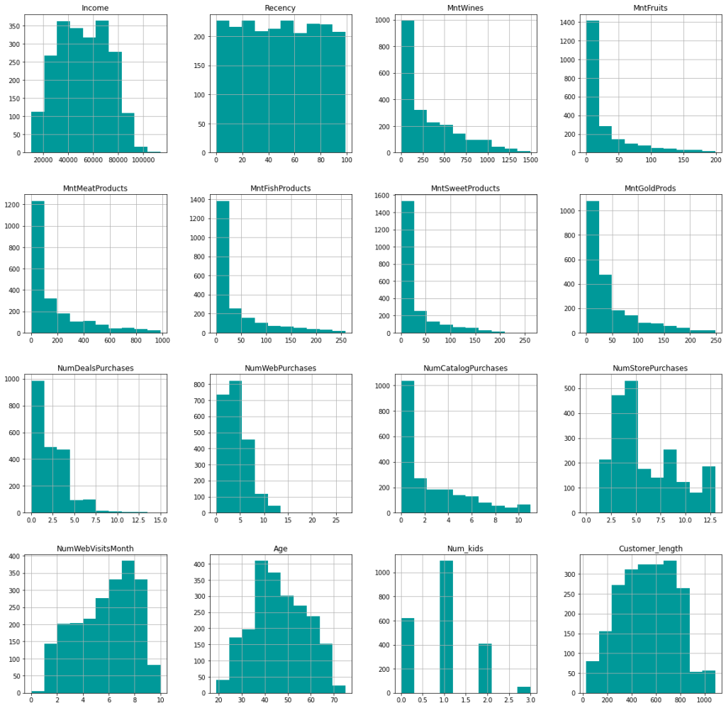
After a few additional tweaks (changing customer initial date to days as customer and getting total number of kids at home) and scaling the data since KMeans works with distances, I’m left with the following features to train the model with:

Note: These distributions are of the unscaled data. ‘Mnt’ is short for amount.

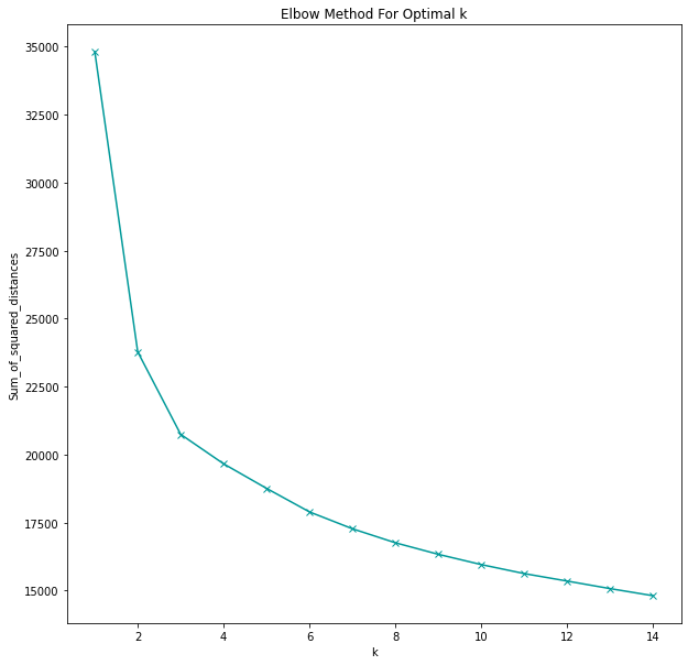
This is unlabeled data, meaning that we don’t know any potential groupings of the customers ahead of time (there is no ground truth). In fact, we don’t even know how many distinct groupings the customers fall into. Instead of just guessing or deciding ahead of time how many groupings there should be, I used a for-loop to plot various group numbers (k) against the within-cluster sum of squares.

sum_of_squared_distances = []
K = range(1,15)
for k in K:
    km = KMeans(n_clusters=k)
    km = km.fit(scaled_df)
    sum_of_squared_distances.append(km.inertia_)

fig,ax = plt.subplots(figsize=(10,10))
plt.plot(
    K, 
    sum_of_squared_distances, 
    'x-', 
    color=TEAL
)
plt.xlabel('k')
plt.ylabel('Sum_of_squared_distances')
plt.title('Elbow Method For Optimal k')

As the number of clusters increases, the sum of squared distances will always increase. Which makes sense, the fewer the members there are in a group, the more alike (or closer in KMeans terms) they are to each other. In fact, we could take this to the extremes:

  • A single group with 2,176 members (the entire customer group in this dataset) will be quite diverse and not have much in common. We can see this on the plot where the sum of squared distances is close to 35,000. Not very helpful, though.
  • On the other extreme, we could have 2,176 groups, each one with a single customer, and the sum of squared errors would be 0. However, that would also be useless information for the company.

The goal is to pick the number of groupings where the sum of squared distances decreases dramatically. On the graph, this is found at the “elbow,” where the first sharp bend is. In this case, it is at k=2.

Further exploration and validation with the silhouette score (which is a ratio of inter- and intra-distances) confirm that two groups give the best results, meaning the groups with the least amount of overlap and the most amount of intra-group similarity as possible.

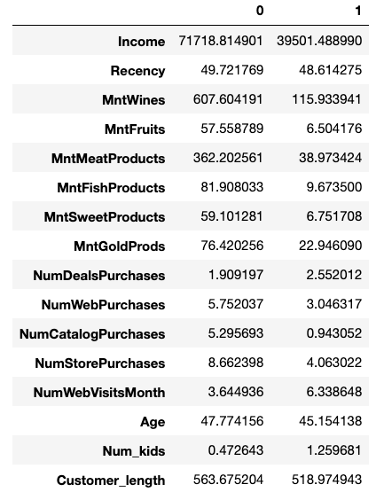
Next, I was curious to see the data for the two cluster centers, as identified by the KMeans algorithm. The following function finds these from the model, uses inverse transform to convert the scaled scores back into something we can understand and creates a dataframe:

def make_center_dict(columns, model):
    center_df = pd.DataFrame(index = columns)
    centers = model.cluster_centers_
    inversed = scale.inverse_transform(centers)
    for i,v in enumerate(inversed):
        center_df[i] = v
    return center_df

two_centers = make_center_dict(df_cont.columns, model_2)
two_centers

Interesting! Just from that, we can see some clear differences between the groups.

However, looking at an “average” point for each cluster is just the beginning in understanding what makes the two customer groups different. After all, we don’t want to make changes to a marketing strategy after looking at only two customer profiles which may not even be actual customers! (Think about the danger of making a decision based on “average” salary when you have a group comprised of 25 teachers and Bill Gates.)

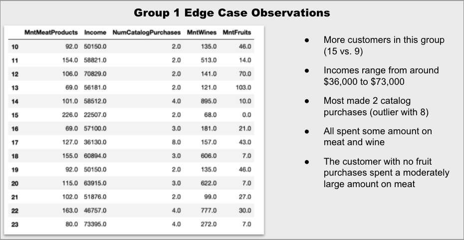
Now that I know the centers, or averages, of each group, I want to next look at the “edge” cases – the customers that are right on the decision hyperplane between cluster 0 and cluster 1. In order to find these points, I will train a Support Vector Classifier on the data and look at its support vectors (the points that lie on the decision boundaries between the groups).

X = df_cont_labeled.drop('labels', axis=1)
y = df_cont_labeled['labels']

sc = StandardScaler()
X_scaled = sc.fit_transform(df_cont_labeled)

svc = SVC(
    random_state=42, 
    kernel = 'linear'
)
svc_model = svc.fit(X_scaled, y)
support_vectors = svc_model.support_vectors_

len(support_vectors)
>24

The classifier found 24 customers that are “edge” cases. That’s not a huge number, but with 16 features each, that’s 384 values to sort through!

Luckily, we can also narrow down the features to focus on in order to check to see what makes these customers fall into one group or the other. Next, I train a Random Forest Classifier on the data in order to determine which features are most important when determining the clusters.

rf= RandomForestClassifier(random_state=42)
rf_model = rf.fit(X_scaled,y)
features = sorted(
    list(
        zip(
            df_cont.columns, 
            rf_model.feature_importances_
        )
    ),
    key=lambda x: -x[1]""
)
top_features = [x[0] for x in features[:5]]
features
[('MntMeatProducts', 0.1325875140229436),
 ('Income', 0.11693628622646278),
 ('NumCatalogPurchases', 0.08272496782641264),
 ('MntWines', 0.058087516662565036),
 ('MntFruits', 0.053469322076748205),
 ('MntFishProducts', 0.03979017944581868),
 ('NumStorePurchases', 0.01988284123103296),
 ('MntSweetProducts', 0.01733732561012342),
 ('MntGoldProds', 0.004250932777045329),
 ('NumWebVisitsMonth', 0.0036362949681056993),
 ('NumDealsPurchases', 0.002998665436278429),
 ('Num_kids', 0.0026965810500057556),
 ('Customer_length', 0.0013411499217806128),
 ('NumWebPurchases', 0.0010166509245525743),
 ('Recency', 0.0009401866460832059),
 ('Age', 0.0006379028966188131)]

Looking at this, it seems that income, number of catalog purchases and the amount spent on meat, wine and fruit accounts for around 44% of the classification decision.

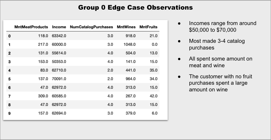
Armed with that information, I’m going to revisit the edge cases. First, I’m going to apply inverse transform to “unscale” the data and structure the results as a dataframe. Then, I will divide the data into two dataframes – one for each group. Finally, I will limit the feature to only the most important, as determined above.

edge_customers = []
for i in range(len(support_vectors)):
    edge_customers.append(
        sc.inverse_transform(support_vectors[i])
    )

edge_df = pd.DataFrame(
    edge_customers, 
    columns=df_cont_labeled.columns
)

edge_0 = edge_df[edge_df['labels'] == 0][top_features]
edge_1 = edge_df[edge_df['labels'] == 1][top_features]

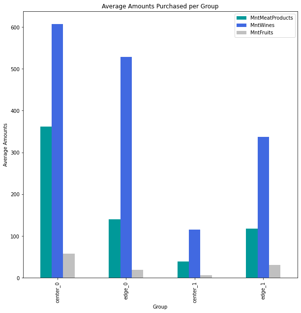
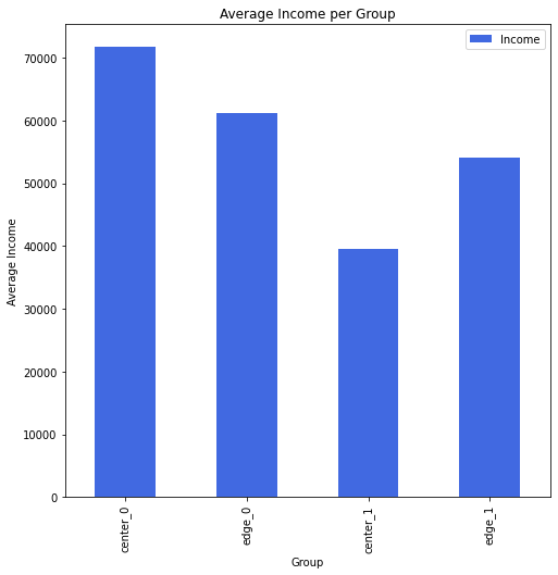
Indeed, it appears that the edge customers are more to each other than the two “center” customers, although it is still difficult to tell just by scanning the numbers. That’s easier to see with some quick graphs:

It is clear that the amount spent on wine is one of the distinguishing factors between the groups, as even the edge case for Group 0 is significantly higher than the edge case for Group 1. The amount spent on meat is much closer for the two edge cases.

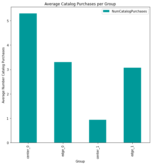
The differences in the number of catalog purchases are also quite similar for the edge groups.

Now that we’ve seen what makes an “average” customer and an “edge” customer for each group, let’s dig a little deeper into the statistics for each group to gain some insight that can help with a marketing plan.

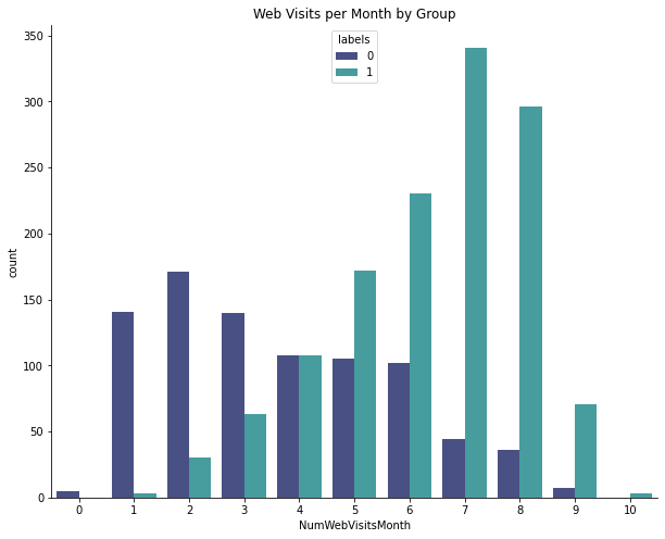
One difference that immediately stood out to me was web behavior for the two groups. Group 1 tends to visit the website more.

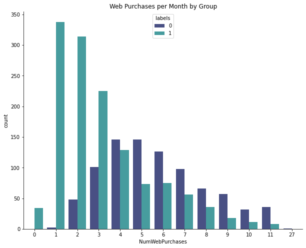
Lots of Group 1 customers have made 1-3 online purchases, but Group 0 is more likely to make multiple purchases. In other words, Group 1 are the browsers and Group 0 are the buyers.

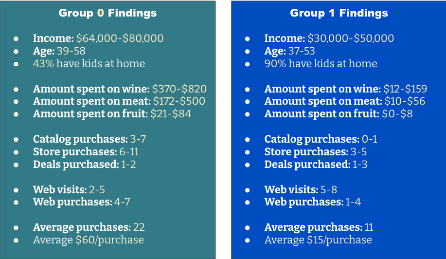
Here is a summary of the more interesting findings. Any of the ranges are the interquartile range (middle 50%) for the group.

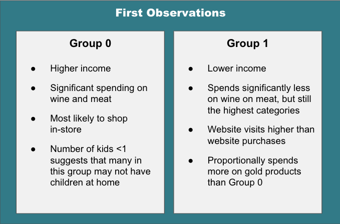
Group 0 is generally older, buys more frequently and spends more per purchase. They make frequent purchases from the storefront and also buy from the catalog and website. They do not seem overly concerned about price or deals.

For Group 0, organize a highlighted area in the store with meat, associated recipe ideas and a selection of wines that complement the meal. In the catalog, feature gift baskets or bundles that also pair meats and wines. Consider adding monthly subscriptions for meat and/or wine and promote them as gift ideas.

Group 1 is younger and is focused on child-rearing. They visit the website frequently, but make more purchases at the store. They are more value-focused.

For Group 1, capitalize on their website visits by suggesting lower-priced items and offering deals or promotions. Consider offering more kid-centric options and positioning adult items as a “date night” option. Ensure that there are plenty of budget wines available. Finally, consider a program to encourage repeated purchases.

Lesson of the Day

Like many learners, I started out seeing the topics as independent. Now, as I’m gaining more experience, I’m beginning to see the connections between concepts.

Frustration of the Day

I’m now about 80-85% through he bootcamp curriculum and I’m at the point where I have to make very deliberate decisions about where to focus. It’s frustrating because I want to learn it all and I want to learn it now.

Win of the Day

I’m finding that I’m much more deliberate in the decisions I’m making about feature engineering and selection.

Current Standing on the Imposter Syndrome Scale

3/5

Looked at job postings and felt good. Presented my non-technical in front of other students and about lost it. Work in progress:)

Not So Mellow Mushrooms: A Classification Task

On my way home, I noticed a few mushrooms that had sprung up after the rain. They were perfect and intact because everyone knew they were poisonous.

— Paulo Coelho

With all of the rain lately, I’ve noticed quite a few mushrooms on my daily walks. Some are tall , balancing caps on top of slender stalks, resembling an art instillation along the trail.

Others hug close to the ground, their gills pressed to the soil as though they are afraid of heights.

Some wear brightly-colored caps that stand out on the woodland floor.

Many are beautiful.

All are interesting.

And some are deadly.

Do YOU know which ones are poisonous?

Starting With the Data

I started by downloading the mushroom.csv from Kaggle. This dataset contains 8,124 hypothetical observations of 23 different mushroom species found in North America. Each observation is described by 22 different features (including shape, color, rings, odor, etc.) and is classified as either edible (yum!) or poisonous (uh oh!).

My goal is to use this labeled dataset to create a model that can be used to determine if you can make a mushroom omelet or if you should keep your distance.

I am going to be using be using a logistic regression model. Before I go any further, I need to check to see if the target variable (class) is balanced. If it is not, I will need to apply a resampling technique in order to have accurate results.

df['class'].value_counts(normalize=True)

We’re in luck! 52% are classified as edible and 48% are deemed poisonous. This means the classes are already balanced.

Next, I have some decisions to make. I decide that I only want to focus on features that are ones that a non-expert could distinguish in the field. Based on this, I’m going to limit my features to only cap-shape, cap-color, gill-color, odor (although I do have some doubt on this one when I consult the documentation and see descriptors of “fishy” and “foul”) and habitat.

I also start to think about what preprocessing I will need to do. All of the data is currently categorical and encoded as strings. In order to perform logistic regression, I will need to make these numerical.

I will use SciKit-learn’s LabelEncoder on the target in order to transform it into 0s and 1s before splitting the data because it will not lead to any data leakage. With the features, I will need to include OneHotEncoder into my pipeline for cross validation in order to prevent data leakage.

#split the features and target
y = df['class']
X = df.drop('class', axis=1)

#select only the desired columns
X = X[['cap-shape', 'cap-color','gill-color','odor','habitat']]

#transform the target
le = LabelEncoder()
y = le.fit_transform(y)

Once encoded, 1 indicates poisonous and 0 corresponds to edible.

Then, before anything else is done, it’s time to train_test_split and set aside the validation data. It’s always a good idea to check the shape of the data to make sure that it’s what you expect.

X_train, X_test, y_train, y_test = train_test_split(X,
                                                    y,
                                                    random_state=44, 
                                                    stratify=y)
X.shape, y.shape

((8124, 5), (8124,))


X_train.shape, X_test.shape, y_train.shape, y_test.shape

((6093, 5), (2031, 5), (6093,), (2031,))

Training the Model

Because all of the predictors will be one hot encoded, there is no need to scale this data. As a result, the pipeline is quite simple.

pipeline = Pipeline(steps = [['ohe', OneHotEncoder(handle_unknown='ignore')],
                             ['classifier', LogisticRegression(random_state=44,
                             max_iter=1000)]])

Next, I will use GridSearch and cross validation in order to access the performance of the model and select the best value for C. This is a regularization hyperparameter, where the smaller the value, the stronger the regularization.

stratified_kfold = StratifiedKFold(n_splits=5,
                                       shuffle=True,
                                       random_state=44)
    
    
param_grid = {'classifier__C':[0.001, 0.01, 0.1, 1, 10, 100, 1000]}

grid_search = GridSearchCV(estimator=pipeline,
                           param_grid=param_grid,
                           scoring=['neg_log_loss', 'f1'],
                           cv=stratified_kfold,
                           n_jobs=-1,
                           refit='neg_log_loss',
                           return_train_score=True)

grid_search.fit(X_train, y_train)

This told me that the ideal value for C is 1000, indicating that not much regularization needs to be done. I quickly examine the metrics for the cross-validated model with C=1000:

param_classifier__C                             1000
params                       {'classifier__C': 1000}
split0_test_neg_log_loss                 -0.00642688
split1_test_neg_log_loss                  -0.0074723
split2_test_neg_log_loss                  -0.0204453
split3_test_neg_log_loss                  -0.0160083
split4_test_neg_log_loss                  -0.0124653
mean_test_neg_log_loss                    -0.0125636
std_test_neg_log_loss                     0.00524552
rank_test_neg_log_loss                             1
split0_train_neg_log_loss                  -0.011294
split1_train_neg_log_loss                 -0.0112726
split2_train_neg_log_loss                -0.00849542
split3_train_neg_log_loss                -0.00930276
split4_train_neg_log_loss                -0.00986136
mean_train_neg_log_loss                   -0.0100452
std_train_neg_log_loss                    0.00110025
split0_test_f1                              0.998296
split1_test_f1                              0.997451
split2_test_f1                              0.993139
split3_test_f1                              0.995723
split4_test_f1                              0.997438
mean_test_f1                                0.996409
std_test_f1                               0.00183693
rank_test_f1                                       1
split0_train_f1                             0.996583
split1_train_f1                             0.996157
split2_train_f1                             0.997226
split3_train_f1                              0.99744
split4_train_f1                             0.997012
mean_train_f1                               0.996884
std_train_f1                              0.00046093

Looking at the log-loss, I notice that the values are consistent across the splits and that the loss is slightly larger for the test set, which is not surprising (remember to consider the opposite of these values as they’re listed). All of the log-loss seems quite small, indicating a small error rate between the predicted class and the actual class.

Next, I look at the f1 scores, which are the harmonic mean of precision and recall, giving a quick idea of overall performance. Again, these are consistent between folds (which is also verified by the very small standard deviations). Additionally, the f1 scores are quite high for both the train and test sets. I decide to proceed with this model.

#Fitting a final model on the entire train set

pipeline_final = Pipeline(steps = [['ohe', OneHotEncoder(handle_unknown='ignore')],
                             ['classifier', LogisticRegression(random_state=44,
                             max_iter=1000, C=1000)]])

best_model = pipeline_final.fit(X_train, y_train)

y_pred = best_model.predict(X_test)
pd.Series(y_pred).value_counts()

#predictions
0    0.519449 #edible
1    0.480551 #poisonous

#actual
e    0.517971 #edible
p    0.482029 #poisonous

Wow! On first glance, that seems like an awesome result! But with data, as with mushrooms, you don’t want to rush to judgment too quickly as the results could be disastrous. So, let’s look a little deeper.

Evaluating the Model

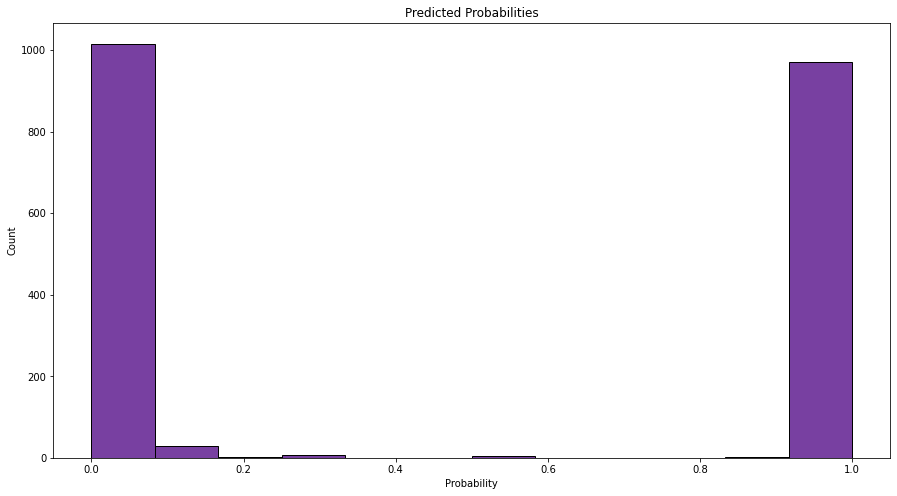
My first step is to make a quick histogram of the probabilities (not just the actual classes) that the model assigned to each data point.

These values are clustered around 0 and 1, which means that the model is quite certain about its predictions. We can also see the roughly 50-50 split that we saw with the actual classifications. Looking good so far.

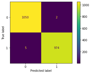
Next, I dig deeper into the metrics by plotting a confusion matrix.

plot_confusion_matrix(pipeline_final, X_test, y_test);

Let’s use this to get three important metrics.

Accuracy

Accuracy is the total number of correct predictions out of the total number of predictions.

2024/(2024+7) = 99.66%

This means the model was correct was correct 99.66% of the time.

Precision

Precision is how many are actually positive (which in this case, is poisonous or 1) out of the ones that the model predicted were positive.

974/(974+2)= 99.80%

This means that of the mushrooms the model indicated were poisonous, 99.8% actually are.

Recall

Recall is out of the actual positive cases (again, poisonous or 1), how many the model recognized as positive.

974/(974+5) = 99.48%

This means that the model picked up on 99.48% of the poisonous mushrooms. Which doesn’t seem so bad unless you happen to be one of those 0.52% of people that inadvertently makes a deadly omelet.

Precision/Recall Tradeoff

This is one of those situations where it is much more preferable to have false positives (a perfectly harmless mushroom is labeled as poisonous) than false negatives (you think a deadly mushroom is harmless). It’s okay if you skip eating a mushroom that won’t hurt you. but it’s a pretty bad day if you eat one that will cause your limbs to fall off of your body.

Adjust the Threshold

As the model is written, it will interpret any probability below 0.5 as a harmless blob of fungi. But because a false negative here is so dangerous, I’m going to set that threshold to 0.1 so that any data points with above a 10% probability of being poisonous will be put into the “Don’t eat!” bin.

def final_model_func(model, X):
    probs = model.predict_proba(X)[:,1]
    return [int(prob > 0.01) for prob in probs]

threshold_adjusted_probs = pd.Series(final_model_func(pipeline_final, X_test))
threshold_adjusted_probs.value_counts(normalize=True)

#new predictions
1    0.520433 #edible
0    0.479567 #poisonous

#original predictions
0    0.519449 #edible
1    0.480551 #poisonous

We can see that by doing that, the percentage of mushrooms classified as poisonous increased slightly. Now, let’s see what happened to our metrics.

print(f"Accuracy: {accuracy_score(y_test, threshold_adjusted_probs)}")
print(f"Precision: {precision_score(y_test, threshold_adjusted_probs)}")
print(f"Recall: {recall_score(y_test, threshold_adjusted_probs)}")

Accuracy: 0.9615952732644018
Precision: 0.9262062440870388
Recall: 1.0

By changing the threshold, the accuracy and the precision both dropped. This is because the model is now classifying some harmless fungi as bad guys. But the tradeoff is worth it because that recall value of 1 says that we’re not going to accidentally ingest a poisonous mushroom (as long as we listen to the model, that is!)

Interpreting the Model

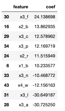
Let’s look at the features with the largest or smallest coefficients, as these are the characteristics that are the most impactful on the decision.

That’s a little tricky to interpret since the features have been one hot encoded. Let’s remind ourselves what the general categories are.

x0 = ‘cap-shape’

x1 = ‘cap-color’

x2 = ‘gill-color’

x3 = ‘odor’

x4 = ‘habitat’

Looking at the most impactful coefficients, x0 does not appear, so cap shape is not a great predictor of the presence of poison. The rest can be attributed to cap-color (10%), gill-color (20%), odor (60%) and habitat (10%). So, it looks like your nose knows if a mushroom will harm you.

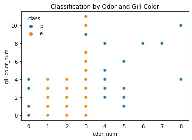
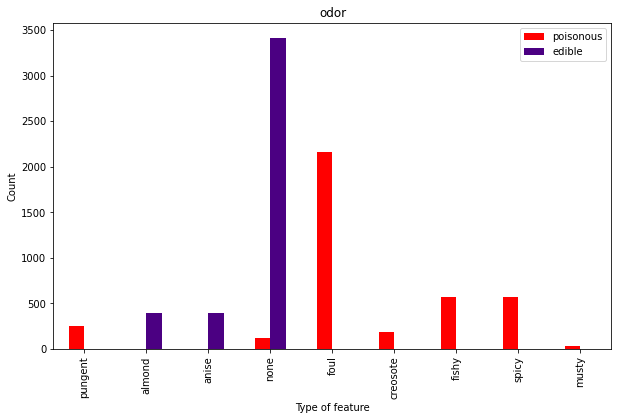
This can be confirmed with the following graph, which clearly shows that odor alone is a pretty good separator of poisonous vs. tasty shrooms.

But that’s still not super helpful. After all, what DO the dangerous ones smell like?

Well, that’s actually pretty handy After all, if a mushroom smells pungent, foul, fishy, tar-like (creosote) or musty, it’s not exactly begging to be put on your pizza. Buy you might need to look out for those spicy ones and the ones with no discernible odor.

And in case you want to become your own mushroom classification machine, here are the other characteristics.

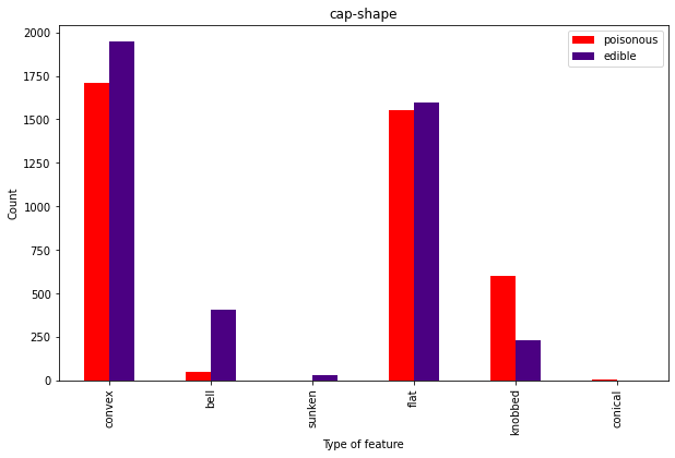
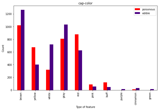
As expected from the coefficients, cap shape isn’t super useful since it doesn’t seem to separate the classes well.

Overall, the caps don’t seem super useful here.

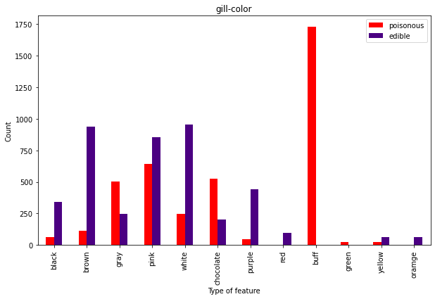
Now we’re talking. You may like the buff guys, but don’t eat the buff fungis:)

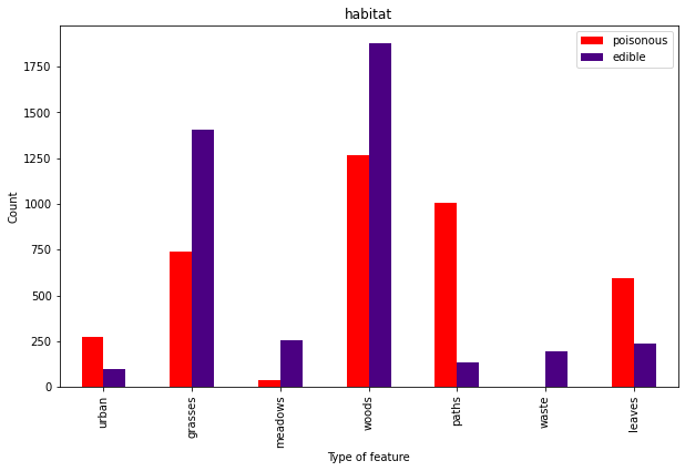
Mental note – don’t eat mushrooms from a pile of leaves on an urban path.

I'M, A FUNGI - Imgflip

Lesson of the Day

I’m finally getting the picture of how cross validation, pipeline and model selection all work together. Whew.

Frustration of the Day

I finish a project. I feel good about it for a couple hours. I learn new things. I feel ashamed of some of the choices I made on my project.

Win of the Day

The frustration above is a sign I’m learning:)

Current Standing on the Imposter Syndrome Scale

3/5

Doing okay at the moment.

A Love Letter to Functions

“Programming isn’t about what you know; it’s about what you can figure out.” 

– Chris Pine

It wasn’t love at first sight.

When I was first introduced to functions, they seemed perfectly fine, but a little bland. Sort of like that person that your grandmother would be happy for you to bring home – steady, predictable and let’s face it, a little boring.

But, oh how wrong I was.

In the beginning, I would tend to forget about them until after the fact, reworking code to include them only after I’d accomplished my goals for the task at hand. I felt something shift as I worked on my most recent project, which dealt with working iteratively to find the best linear regression model for a data set.

For the first time, I found myself coding proactively instead of reactively (which was a goal I set for myself after I got myself into a reactive tangled mess in my first project). After exploring the data but before doing any real work, I thought about what tasks would need to be repeated throughout the project:

  • creating barplots of categorical features vs. the median of the target variable for that category
  • performing train-test-split on dataframes, further splitting into numerical and categorical features, performing scaling and one-hot-encoding, respectively and returning the transformed dataframes
  • creating scatterplots of the residuals
  • creating histograms and boxplots of the residuals
  • calculating (and adding to a dictionary) the R2, adjusted R2, MAE, MSE, RMSE, Durbin-Watson score, J-B score and VIF for each model

I started by using my first model attempt to write and tweak each block of code. Then, once I was satisfied with the output, I modified it and turned them into functions. Functions that I could then easily use for the rest of the project.

That’s when I fell in love. It took mere moments for me to select new features and then create and validate a model using those parameters. As I worked, I decided that some things in the graphs or model validation needed changing and in seconds, the changes were applied to every model that I had created (which at one point, was up to 14!). It was fast. It was easy. And it allowed me to focus on the models rather than on typing out a bunch of code.

It’s still a new relationship and I have much yet to learn about all that functions have to offer. My next goal is to get better at writing smaller functions that can then be assembled into larger ones. I also still end up repeating some code that could be written as a function and I’m still learning how to use global variables to my advantage.

But that’s okay. This is love; I have a lifetime to get to know them better:)

Here’s the function I wrote to handle the train-test-split process.

def split_and_process(df, target, test_size=0.25, random_state = 100):
    
    """Takes in a dataframe and the name of the target. Splits the dataframe
    into X_train, X_test, y_train, y_test. Next, the features are divided into
    numerical and categorical and are scaled and one-hot-encoded, 
    respectively. Finally, these are changed back into dataframes and the 
    transformed X_train, X_test, y_train, y_test dataframes are returned."""
    
    df = df.copy()
    X = df.drop(target, axis=1)
    y = df[target]
    
    X_train, X_test, y_train, y_test = train_test_split(
        X,y, test_size=test_size, random_state=random_state)
    
    num = X_train.select_dtypes('number').columns
    cat = X_train.select_dtypes('object').columns
    
   
    ohe = OneHotEncoder(drop='first', sparse=False)
    X_train_cat = ohe.fit_transform(X_train[cat])
    X_train_cat = pd.DataFrame(X_train_cat, 
                               columns = ohe.get_feature_names(cat))

    X_test_cat = ohe.transform(X_test[cat])
    X_test_cat = pd.DataFrame(X_test_cat, 
                              columns = ohe.get_feature_names(cat))


    scale = StandardScaler()
    X_train_num = scale.fit_transform(X_train[num])
    X_train_num = pd.DataFrame(X_train_num, columns=num)

    X_test_num = scale.transform(X_test[num])
    X_test_num = pd.DataFrame(X_test_num, columns = num)
    
    X_train_processed = pd.concat([X_train_num, X_train_cat], 
                                  axis=1).reset_index(drop=True)
    X_test_processed = pd.concat([X_test_num, X_test_cat], axis=1)

    y_train = y_train.reset_index(drop=True)
    
    return X_train_processed, X_test_processed, y_train, y_test

Lesson of the Day

I just used the Scikit Learn Pipeline tool for the first time in this project. It, and so many other tools in Scikit Learn, make me appreciate code that is well-written for the intended purpose.

Frustration of the Day

It’s hard to know when something is “good enough” and it’s time to call it a day.

Win of the Day

I had a MUCH easier time with my 2nd project – I planned better, I had to look up fewer things and I broke through roadblocks much faster. I’m learning!

Current Standing on the Imposter Syndrome Scale

2/5

Feeling pretty good today:)

The Problem With Teaching to the Test

Education must enable one to sift and weigh evidence, to discern the true from the false, the real from the unreal, and the facts from the fiction.”

~ Martin Luther King, Jr.

Whether you’re working with students in a classroom or a machine learning algorithm housed on a computer, teaching to the test can have some serious unintended consequences.

Imagine this scenario-

You sign your teenager up for SAT-prep classes twice a week. They learn strategies on taking the test, drill concepts that are heavily covered on the exam and, at the end of every session, take a practice SAT built from previously-released test questions.

And all that preparation seems to pay off when your child scores a 1560 (out of 1600) on the actual SAT. You take them out to dinner to celebrate and promptly order a “My Child is An SAT Champion!” bumper sticker for your car.

So imagine your shock several months later when your child, now hundreds of miles away at college, calls to inform you that they have failed out of school. “What happened?,” you wonder, as you painstakingly peel the bumper sticker off. “I thought they knew what they needed to know in order to be successful.”

We expect scores to give us information not only about current mastery, but also about future performance.

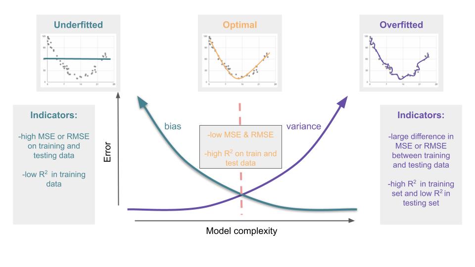
So what DID happen? Well, all of that SAT prep taught your child how to excel on the SAT. As a result, they were accurate on the exam, but their narrow focus and rigidity in thinking meant that they struggled to generalize and apply their knowledge to novel situations that didn’t closely mirror what they had been trained on. So you ended up with a kid that excelled at one thing, yet failed when it really mattered.

And this same thing can happen when we’re working with data –

After spending hours painstakingly cleaning and prepping your training data, you start by fitting a linear regression model of a few of the most promising features. When you run the statistics, you note that R2 = 0.76, indicating that 76% of the variability in the dependent target variable can be described by the independent variables in your model. “Not bad,” you think, “But I know that I can bring that up more.”

You start by adding more features and you watch the coefficient of determination slowly tick up to 0.84. Still not satisfied, you apply some polynomial transformations to your predictors, squaring and cubing values to try to better match the slight curves you notice when you plot your data.

“Ah ha!,” you exclaim, when you see that R2 has reached a dizzying height of 0.97 and the target line on your graph sinuously weaves through most of the actual data points. You take yourself out to dinner to celebrate and promptly order a bumper sticker that reads, “My Model is Better Than Your Model.”

Then, the next day at work, you confidently feed the test data into your model, expecting sheer brilliance to come out. Instead, you see…

R2 = 0.42

Frustrated and confused, you stomp off to the parking lot, where you surreptitiously peel off your bumper sticker (you smartly went for vinyl this time). “I just don’t get it,” you think to yourself, “My model did so well on the training data.”

We expect models to give us information not only about current mastery, but also about future performance.

So what DID happen? By using so many predictors and making a complex model that ascribed importance to every little fluctuation in the data, you created a model that describes the training data very well but fell apart when asked to predict on new information. In essence, you taught to the test by teaching it complex rules for one situation that don’t readily apply to new situations. So you ended up with an overfitted model that excelled at one thing, but failed when it really mattered.

So what’s the solution?

Before we settle on the “sweet spot,” let’s first explore the other extreme –

Going back to our teenager example, let’s imagine them sitting in a math class where the teacher decides that instead of covering the entire Algebra 1 curriculum as expected, she will only teach her students 3 concepts all year. Not surprisingly, when these students take the End of Course exam (that tests the entirety of the curriculum), they all (consistently, at least) perform terribly. The students were not provided with enough information to make valid conclusions.

When it comes to data, this extreme happens when the model is too simplistic, ignoring many of the characteristics of the data. The model is off the mark, spitting out predicted values that are far away from the actual ones, much like a person lost in the woods trying to follow a vague and poorly-written set of directions. This underfitted model is so basic that’s it’s uninformative and ultimately useless.

We want to find a balance between being well-informed enough to make quality decisions and being flexible enough to apply this knowledge to novel situations.

The goal in child-rearing is to launch a child that has been exposed to enough information to build knowledge, but has also had the freedoms to learn how to think and act when they’re thrust into a new environment.

The goal in model-building is to to create a model that has been trained on enough information to recognize and quantify patterns, but is not too tightly leashed so that it can create meaningful predictions on data that it has never seen.

Bias vs. Variance

In data science, the term bias is used to describe the difference between the average prediction of the model and the true value. Basically, this is how far off the mark the model is. A model with high bias is not accurate.

The variance of the model is the average distance between each model prediction and the average prediction of the model. In simple terms, this is a measure of how consistent the model is. A model with high variance is not reproducible.

There is usually a trade-off between these two sources of model error.

In practice, to find this sweet spot of optimal model complexity, create multiple models of varying complexity and use cross validation to find the one with the least amount of total error.

Unfortunately, there are no related processes that will assist with the raising of teenagers.

Lesson of the Day

I’ve learned about the assumptions for multiple linear regression: 1) linear relationship, 2) normal distribution of the errors, 3) homoscedasticity of the errors and 4) independence of the predictors AND how to test for these.

Frustration of the Day

My brain is so full of new information that I’m having trouble organizing all my thoughts and synthesizing the new knowledge.

Win of the Day

So it wasn’t today, but I got overall good feedback on my Phase 1 project. That was a BIG exhale.

Current Standing on the Imposter Syndrome Scale

4/5

The sheer volume of information to master is making me feel quite inept.

Do Cloudy Countries Produce More Heavy Metal Music?

Practice With Web Scraping and Data Manipulation Using Python, Pandas and BeautifulSoup

“Your curiosity is your growth point. Always.”

— Danielle LaPorte

It’s been raining quite a bit in Atlanta these past few weeks and I’ve noticed that as the skies become more overcast, my playlist veers heavier and heavier. Which led me to wonder – do cloudy countries produce more heavy metal music?

I’m at the point in my data science journey where I have some grasp on the basic tools used to capture, manipulate, visualize and interpret data. In order to practice these skills and hopefully find and answer to my pressing question, I decided to do a little webscraping.

First, I needed to find appropriate data sources. Since I am new to web scraping and not proficient in html, I knew I wanted one of these sources to be Wikipedia, figuring that I could find walkthroughs on navigating their html if needed.

Sure enough, I could find information about the annual amount of sunshine in various countries on this Wikipedia page.

The first thing I noticed is that there are multiple cities listed for each country. Because I wanted a single value for each country, I decided that I would eventually average together the given numbers for each country.

Next, I needed information about the number of heavy metal bands per capita for each country. Luckily, I was able to find a page that had already created a table with the 2021 data from The Encyclopaedia Metallum (perfect for my nascent webscraping skills).

One of the nice features of this table is that it already had a column for the per capita rate of heavy metal bands.

Once I decided upon my data sources, I started gathering the data that I needed. I started with the heavy metal data.

import re
import pandas as pd
import matplotlib.pyplot as plt
import requests
from bs4 import BeautifulSoup

%matplotlib inline


#Get the contents of the website that contains the band info

r = requests.get('https://www.geographyrealm.com/geography-of-heavy-metal-bands/')


#Create a BeatifulSoup object of the contents
soup = BeautifulSoup(r.content, 'html.parser')

#Select only the last table, which contains all of the countries
page = soup.find('div', id = 'page')
table = page.findAll('table')[-1]


Now that I had the html for the table in a parsable format, I needed to iterate through, grabbing only the country names and the per capita rate of heavy metal bands. I noticed that the rates were stored as strings, so I created a function to convert them to floats as I grabbed them.

#Function created to change string numerical values into floats

def clean_num(num):
    num = num.replace(',','')
    return float(num)


#Initialize empty lists to hold the values

countries = []
rates = []

#Iterate through each row in the table

for row in table:
    
    #Each row is marked with the html tag <tr>
    rows = table.findAll('tr')
    
    #Each cell is marked with the tag <td>
    for row in rows[1:]:
        cells = row.findAll('td')
        
        #Isolate the country and append to country list
        country = cells[0]
        countries.append(country.text.strip())
        
        #Isolate the rate, clean it and append to rate list
        rate = cells[1]
        rates.append(clean_num(rate.text.strip()))


#Create a DataFrame from the two lists

bands = pd.DataFrame(rates, countries).reset_index()
bands.columns = ['Country', 'Rate']

#Inspect the DataFrame
bands.head()


That DataFrame looked good, so I moved on to the Wikipedia page.

#Get the contents of the Wikipedia site with sunshine information

r2 = requests.get('https://en.wikipedia.org/wiki/List_of_cities_by_sunshine_duration')


#Create a BeautifulSoup object with the contents

soup2 = BeautifulSoup(r2.content, 'html.parser')


#Select only the tables from the site

tables = soup2.findAll('table')


This page was a little tricker. Since Wikipedia had several tables, one for each continent, I had to iterate over the tables and then the rows and cells. I knew that I wanted to consolidate the cities to get a single average annual sunshine value for each country. I decided to do that after I created a DataFrame with all of the given rows.

#Initialize lists to hold the country and yearly sun information

countries2 = []
sun = []

#Iterate through each table on the page

for table in tables:
    
    #Each row is marked with the tag <tr>
    rows = table.findAll('tr')
    
    #Each cell is marked with the tag <td?
    for row in rows[1:]:
        cells = row.findAll('td')
        
        #Isolate the country and append to countries2 list
        country = cells[0]
        countries2.append(country.text.strip())
        
        #Isolate the annual sun, clean it and append to sun list
        sun_yr = cells[14]
        sun.append(clean_num(sun_yr.text.strip()))

I ran into a little problem when I first ran this block. Originally, I had

sun_yr = cells[-2]

because for the first table, the second to last column had the data I wanted. However, when I tried that code, I received an error when the value was run through the clean_num() function that said that ‘[115]’ could not be parsed as a float. Two things immediately stood out to me about that value – 115 was way too small to be the average annual hours of sunlight for even the cloudiest of places and the brackets looked like the values in the last column, which contained the links to the citations. Sure enough, when I looked at the table for Europe, I noticed that the last column was formatted differently than the other tables. To solve this, I read the index from the left ([14]) instead of the right ([-2]).

Next, it was time to make a DataFrame and use groupby and avg() to organize the data by country.

#Create a DataFrame from the countries2 and sun lists

sun_df = pd.DataFrame(sun, countries2).reset_index()
sun_df.columns = ['Country', 'Sun']

#Use groupby to aggregate the table by country with average annual sun

sun_df = sun_df.groupby('Country')['Sun'].mean().reset_index()
sun_df.columns = ['Country', 'Avg_Sun']
sun_df.head()

Now that I had my two tables, I checked the length of each. I had 140 countries in the heavy metal table and 145 in the sunshine table. That was close enough for me, and I decided not to worry about the 5 countries with no music data.

I merged the two tables, which dropped the 5 rows without corresponding music data. The resulting table only had 102 entries, which is most likely due to slight variations in how countries were named between the two data sources. Because this is a rather silly question of no consequence, I decided not to dig into these missing rows.

#Merge the two DataFrames together

sun_and_bands = bands.merge(sun_df)
sun_and_bands.head()

Now that I had the data in a form that was easy to read, I decided to take a look at the top 5 and bottom 5 countries by per capita number of heavy metal bands.

#Sort by rate of bands and find top 5 and bottom 5 countries

top_5 = sun_and_bands.sort_values(
    'Rate', 
    ascending = False)[:5].reset_index(drop = True)

bottom_5 = sun_and_bands.sort_values(
    'Rate', 
    ascending = False)[-5:].reset_index(drop = True)

No surprises there and also some suggestions that there may be something to the idea that cloudy weather leads to more heavy metal.

Before making a scatterplot, I wanted to quickly see the summary statistics for the entire dataset.

#Get the summary statistics for all countries

sun_and_bands.describe()

I noticed that the mean number of heavy metal bands per 100,000 people (about 4) was significantly higher than the median of around 2. This suggests that there are a small group of countries that are metal powerhouses, while the vast majority are more sedate in their musical tastes.

I also noted that the median of annual hours of sun is around 2300. I would then define any country below that as more cloudy and those in the bottom 25% (less than 2000 hours of sun a year) as positively gloomy.

Finally, it was time to make a scatterplot to more easily see the correlation between cloudiness and metalness.

#Create a graph object

fig, ax = plt.subplots(figsize = (12,9))

#Make a scatterplot with Average Sun per Year vs. Heavy Metal Bands per Capita

ax.scatter(
    x = sun_and_bands['Avg_Sun'], 
    y = sun_and_bands['Rate'],
    s = 10)

ax.set_xlabel('Avg Sun per Year')
ax.set_ylabel('Heavy Metal Bands per 100000 People')
ax.set_title(
    'Do Cloudy Countries Produce More Heavy Metal Music?',
    fontweight = 'bold', 
    fontsize = 20, 
    color = 'blue')

#Label the top_5 countries

for i in range(5):
    ax.text(
        x=top_5.loc[i, 'Avg_Sun'], 
        y=top_5.loc[i, 'Rate'], 
        s=top_5.loc[i, 'Country'], 
        size = 14, 
        )

Well, look at that! The top 5 countries for spawning heavy metal bands all happen to fall in the “positively gloomy” category. From what I remember, those are also some of the countries that rank the highest on the “happiness” metric. Interesting:)

So now the question remains, do clouds inspire musicians to get their thrash on, or do the epic sounds of their guitars summon the gods of thunder?

Lesson of the Day

I learned how to label the points in a scatterplot using ax.text(x = x_coor, y = y_coor, s = text).

Frustration of the Day

My impatience. I was introduced to Plotly Dash yesterday and I’m in love. I want to know all the things, and I want to know them now.

Win of the Day

One of my goals is to become more confident at going “off script,” working on things that are not assigned to me and do not come with the security blanket of an answer key. Today’s exploration was exactly that!

Current Standing on the Imposter Syndrome Scale

3/5

Design a site like this with WordPress.com
Get started