
Practice With Web Scraping and Data Manipulation Using Python, Pandas and BeautifulSoup
“Your curiosity is your growth point. Always.”
— Danielle LaPorte
It’s been raining quite a bit in Atlanta these past few weeks and I’ve noticed that as the skies become more overcast, my playlist veers heavier and heavier. Which led me to wonder – do cloudy countries produce more heavy metal music?
I’m at the point in my data science journey where I have some grasp on the basic tools used to capture, manipulate, visualize and interpret data. In order to practice these skills and hopefully find and answer to my pressing question, I decided to do a little webscraping.
First, I needed to find appropriate data sources. Since I am new to web scraping and not proficient in html, I knew I wanted one of these sources to be Wikipedia, figuring that I could find walkthroughs on navigating their html if needed.
Sure enough, I could find information about the annual amount of sunshine in various countries on this Wikipedia page.
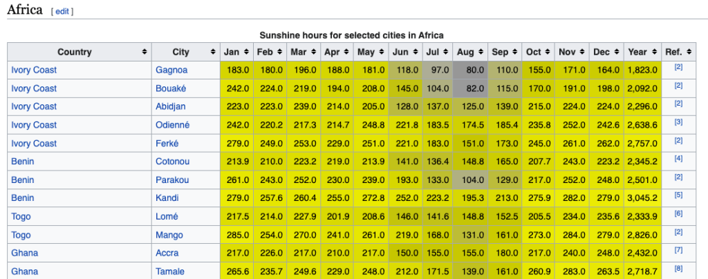
The first thing I noticed is that there are multiple cities listed for each country. Because I wanted a single value for each country, I decided that I would eventually average together the given numbers for each country.
Next, I needed information about the number of heavy metal bands per capita for each country. Luckily, I was able to find a page that had already created a table with the 2021 data from The Encyclopaedia Metallum (perfect for my nascent webscraping skills).
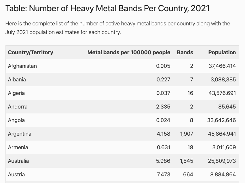
One of the nice features of this table is that it already had a column for the per capita rate of heavy metal bands.
Once I decided upon my data sources, I started gathering the data that I needed. I started with the heavy metal data.
import re
import pandas as pd
import matplotlib.pyplot as plt
import requests
from bs4 import BeautifulSoup

%matplotlib inline


#Get the contents of the website that contains the band info

r = requests.get('https://www.geographyrealm.com/geography-of-heavy-metal-bands/')


#Create a BeatifulSoup object of the contents
soup = BeautifulSoup(r.content, 'html.parser')

#Select only the last table, which contains all of the countries
page = soup.find('div', id = 'page')
table = page.findAll('table')[-1]
Now that I had the html for the table in a parsable format, I needed to iterate through, grabbing only the country names and the per capita rate of heavy metal bands. I noticed that the rates were stored as strings, so I created a function to convert them to floats as I grabbed them.
#Function created to change string numerical values into floats
def clean_num(num):
num = num.replace(',','')
return float(num)
#Initialize empty lists to hold the values
countries = []
rates = []
#Iterate through each row in the table
for row in table:
#Each row is marked with the html tag <tr>
rows = table.findAll('tr')
#Each cell is marked with the tag <td>
for row in rows[1:]:
cells = row.findAll('td')
#Isolate the country and append to country list
country = cells[0]
countries.append(country.text.strip())
#Isolate the rate, clean it and append to rate list
rate = cells[1]
rates.append(clean_num(rate.text.strip()))
#Create a DataFrame from the two lists
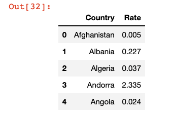
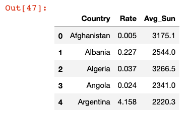
bands = pd.DataFrame(rates, countries).reset_index()
bands.columns = ['Country', 'Rate']
#Inspect the DataFrame
bands.head()
That DataFrame looked good, so I moved on to the Wikipedia page.
#Get the contents of the Wikipedia site with sunshine information

r2 = requests.get('https://en.wikipedia.org/wiki/List_of_cities_by_sunshine_duration')


#Create a BeautifulSoup object with the contents

soup2 = BeautifulSoup(r2.content, 'html.parser')


#Select only the tables from the site

tables = soup2.findAll('table')
This page was a little tricker. Since Wikipedia had several tables, one for each continent, I had to iterate over the tables and then the rows and cells. I knew that I wanted to consolidate the cities to get a single average annual sunshine value for each country. I decided to do that after I created a DataFrame with all of the given rows.
#Initialize lists to hold the country and yearly sun information

countries2 = []
sun = []

#Iterate through each table on the page

for table in tables:

    #Each row is marked with the tag <tr>
    rows = table.findAll('tr')

    #Each cell is marked with the tag <td?
    for row in rows[1:]:
        cells = row.findAll('td')

        #Isolate the country and append to countries2 list
        country = cells[0]
        countries2.append(country.text.strip())

        #Isolate the annual sun, clean it and append to sun list
        sun_yr = cells[14]
        sun.append(clean_num(sun_yr.text.strip()))
I ran into a little problem when I first ran this block. Originally, I had
sun_yr = cells[-2]
because for the first table, the second to last column had the data I wanted. However, when I tried that code, I received an error when the value was run through the clean_num() function that said that ‘[115]’ could not be parsed as a float. Two things immediately stood out to me about that value – 115 was way too small to be the average annual hours of sunlight for even the cloudiest of places and the brackets looked like the values in the last column, which contained the links to the citations. Sure enough, when I looked at the table for Europe, I noticed that the last column was formatted differently than the other tables. To solve this, I read the index from the left ([14]) instead of the right ([-2]).
Next, it was time to make a DataFrame and use groupby and avg() to organize the data by country.
#Create a DataFrame from the countries2 and sun lists
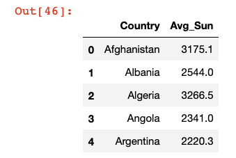
sun_df = pd.DataFrame(sun, countries2).reset_index()
sun_df.columns = ['Country', 'Sun']
#Use groupby to aggregate the table by country with average annual sun
sun_df = sun_df.groupby('Country')['Sun'].mean().reset_index()
sun_df.columns = ['Country', 'Avg_Sun']
sun_df.head()
Now that I had my two tables, I checked the length of each. I had 140 countries in the heavy metal table and 145 in the sunshine table. That was close enough for me, and I decided not to worry about the 5 countries with no music data.
I merged the two tables, which dropped the 5 rows without corresponding music data. The resulting table only had 102 entries, which is most likely due to slight variations in how countries were named between the two data sources. Because this is a rather silly question of no consequence, I decided not to dig into these missing rows.
#Merge the two DataFrames together

sun_and_bands = bands.merge(sun_df)
sun_and_bands.head()
Now that I had the data in a form that was easy to read, I decided to take a look at the top 5 and bottom 5 countries by per capita number of heavy metal bands.
#Sort by rate of bands and find top 5 and bottom 5 countries

top_5 = sun_and_bands.sort_values(
    'Rate',
    ascending = False)[:5].reset_index(drop = True)

bottom_5 = sun_and_bands.sort_values(
    'Rate',
    ascending = False)[-5:].reset_index(drop = True)
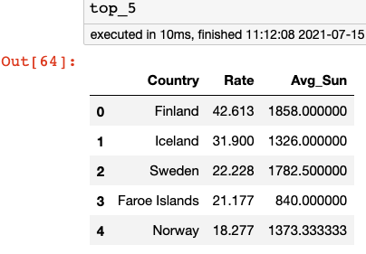
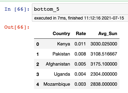
No surprises there and also some suggestions that there may be something to the idea that cloudy weather leads to more heavy metal.
Before making a scatterplot, I wanted to quickly see the summary statistics for the entire dataset.
#Get the summary statistics for all countries

sun_and_bands.describe()
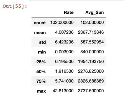
I noticed that the mean number of heavy metal bands per 100,000 people (about 4) was significantly higher than the median of around 2. This suggests that there are a small group of countries that are metal powerhouses, while the vast majority are more sedate in their musical tastes.

I also noted that the median of annual hours of sun is around 2300. I would then define any country below that as more cloudy and those in the bottom 25% (less than 2000 hours of sun a year) as positively gloomy.

Finally, it was time to make a scatterplot to more easily see the correlation between cloudiness and metalness.
#Create a graph object

fig, ax = plt.subplots(figsize = (12,9))

#Make a scatterplot with Average Sun per Year vs. Heavy Metal Bands per Capita

ax.scatter(
    x = sun_and_bands['Avg_Sun'],
    y = sun_and_bands['Rate'],
    s = 10)

ax.set_xlabel('Avg Sun per Year')
ax.set_ylabel('Heavy Metal Bands per 100000 People')
ax.set_title(
    'Do Cloudy Countries Produce More Heavy Metal Music?',
    fontweight = 'bold',
    fontsize = 20,
    color = 'blue')

#Label the top_5 countries

for i in range(5):
    ax.text(
        x=top_5.loc[i, 'Avg_Sun'],
        y=top_5.loc[i, 'Rate'],
        s=top_5.loc[i, 'Country'],
        size = 14,
        )
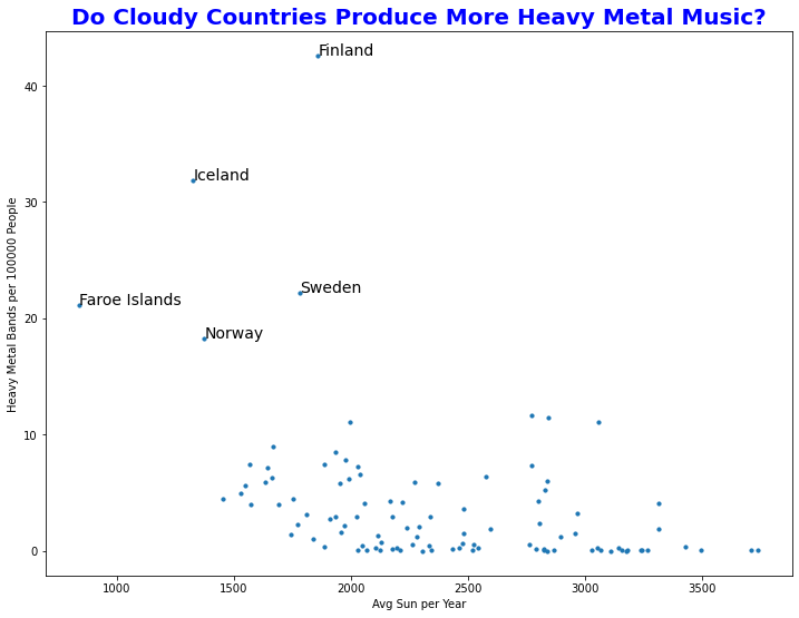
Well, look at that! The top 5 countries for spawning heavy metal bands all happen to fall in the “positively gloomy” category. From what I remember, those are also some of the countries that rank the highest on the “happiness” metric. Interesting:)
So now the question remains, do clouds inspire musicians to get their thrash on, or do the epic sounds of their guitars summon the gods of thunder?

Lesson of the Day
I learned how to label the points in a scatterplot using ax.text(x = x_coor, y = y_coor, s = text).

Frustration of the Day
My impatience. I was introduced to Plotly Dash yesterday and I’m in love. I want to know all the things, and I want to know them now.

Win of the Day
One of my goals is to become more confident at going “off script,” working on things that are not assigned to me and do not come with the security blanket of an answer key. Today’s exploration was exactly that!

Current Standing on the Imposter Syndrome Scale
3/5
