
“A satisfied customer is the best business strategy of all. “
Michael LeBoeuf
In order for retailers to maximize customer satisfaction, they first have to understand those customers. Since companies may have thousands, hundreds of thousands or even millions of customers, that often comes down to dividing customers into related groups and then working to understand the motivations and behaviors of a particular group.
The dataset that I’m working with has 2,240 observations from a company that sells food, wine and gold products through a storefront, catalog and website. Each record contains information about a single customer and has basic demographic information along with data about what they have purchased from the company and where the transactions occured.
My goal is to use KMeans, an unsupervised machine learning model that uses “distances” between features, to group the customers into like-behavior clusters and then analyze the data to make recommendations to the company to increase their sales.
This data isn’t too messy, but it still needs a little polish and a little pruning before getting down to business. First, I dropped the 24 rows that were missing data from the ‘Income’ column. I could have decided to impute these with the median income, but that risks creating misleading information and the deletion of the rows only results in a loss of about 1% of the obeservations.
Next, I looked at the “YearBirth” column. This was my first indication that either customers may not have been honest when submitting their demographic information or that there were some errors in data entry since there were three customers that were 115 or older, based upon their birth year! I went ahead and replaced this column with each customer’s approximate age and removed the three centenarians.
There were some shenanigans in the marital status column as well. Although the majority of customers fall into the expected categories of married, together, single and divorced, there are also four shoppers that classify their relationships as “YOLO” or “Absurd.” No judgment on how they want to live their lives, but those categories are difficult to interpret here. The “Education” column wasn’t quite as entertaining, but it also had values that were difficult to interpret.
I decided to drop the three categorical columns (ID, marital status and education) before using the model. The first one doesn’t contain any useful information and the latter two have the issues mentioned above. Additionally, KMeans cannot handle categorical values and so another approach or additional engineering would be required.
The “Income” column also has some anomalies. One person claimed to have an annual salary of $666,666 and several seemed to record their monthly instead of their annual income. I made the decision to remove these rows.
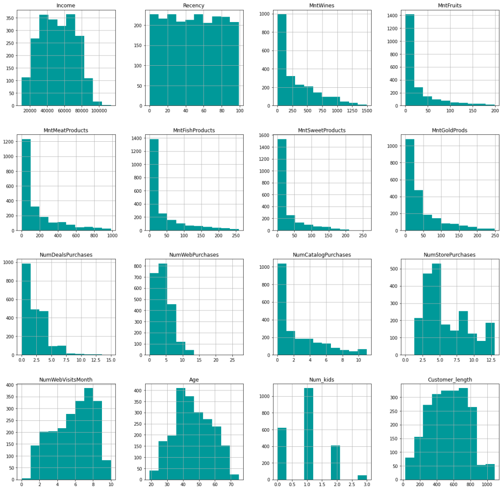
After a few additional tweaks (changing customer initial date to days as customer and getting total number of kids at home) and scaling the data since KMeans works with distances, I’m left with the following features to train the model with:
This is unlabeled data, meaning that we don’t know any potential groupings of the customers ahead of time (there is no ground truth). In fact, we don’t even know how many distinct groupings the customers fall into. Instead of just guessing or deciding ahead of time how many groupings there should be, I used a for-loop to plot various group numbers (k) against the within-cluster sum of squares.
sum_of_squared_distances = []
K = range(1,15)
for k in K:
    km = KMeans(n_clusters=k)
    km = km.fit(scaled_df)
    sum_of_squared_distances.append(km.inertia_)

fig,ax = plt.subplots(figsize=(10,10))
plt.plot(
    K,
    sum_of_squared_distances,
    'x-',
    color=TEAL
)
plt.xlabel('k')
plt.ylabel('Sum_of_squared_distances')
plt.title('Elbow Method For Optimal k')
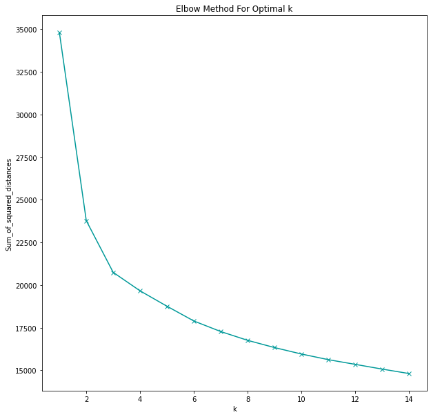
As the number of clusters increases, the sum of squared distances will always increase. Which makes sense, the fewer the members there are in a group, the more alike (or closer in KMeans terms) they are to each other. In fact, we could take this to the extremes:
- A single group with 2,176 members (the entire customer group in this dataset) will be quite diverse and not have much in common. We can see this on the plot where the sum of squared distances is close to 35,000. Not very helpful, though.
- On the other extreme, we could have 2,176 groups, each one with a single customer, and the sum of squared errors would be 0. However, that would also be useless information for the company.
The goal is to pick the number of groupings where the sum of squared distances decreases dramatically. On the graph, this is found at the “elbow,” where the first sharp bend is. In this case, it is at k=2.
Further exploration and validation with the silhouette score (which is a ratio of inter- and intra-distances) confirm that two groups give the best results, meaning the groups with the least amount of overlap and the most amount of intra-group similarity as possible.
Next, I was curious to see the data for the two cluster centers, as identified by the KMeans algorithm. The following function finds these from the model, uses inverse transform to convert the scaled scores back into something we can understand and creates a dataframe:
def make_center_dict(columns, model):
    center_df = pd.DataFrame(index = columns)
    centers = model.cluster_centers_
    inversed = scale.inverse_transform(centers)
    for i,v in enumerate(inversed):
        center_df[i] = v
    return center_df

two_centers = make_center_dict(df_cont.columns, model_2)
two_centers
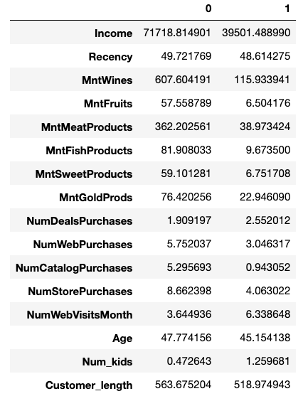
Interesting! Just from that, we can see some clear differences between the groups.
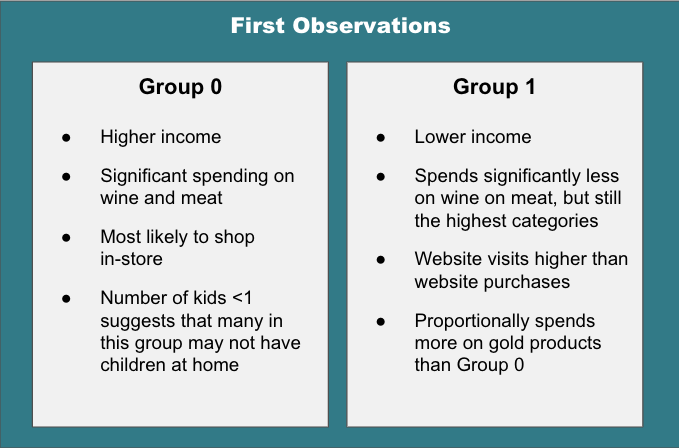
However, looking at an “average” point for each cluster is just the beginning in understanding what makes the two customer groups different. After all, we don’t want to make changes to a marketing strategy after looking at only two customer profiles which may not even be actual customers! (Think about the danger of making a decision based on “average” salary when you have a group comprised of 25 teachers and Bill Gates.)
Now that I know the centers, or averages, of each group, I want to next look at the “edge” cases – the customers that are right on the decision hyperplane between cluster 0 and cluster 1. In order to find these points, I will train a Support Vector Classifier on the data and look at its support vectors (the points that lie on the decision boundaries between the groups).
X = df_cont_labeled.drop('labels', axis=1)
y = df_cont_labeled['labels']

sc = StandardScaler()
X_scaled = sc.fit_transform(df_cont_labeled)

svc = SVC(
    random_state=42,
    kernel = 'linear'
)
svc_model = svc.fit(X_scaled, y)
support_vectors = svc_model.support_vectors_

len(support_vectors)
>24
The classifier found 24 customers that are “edge” cases. That’s not a huge number, but with 16 features each, that’s 384 values to sort through!
Luckily, we can also narrow down the features to focus on in order to check to see what makes these customers fall into one group or the other. Next, I train a Random Forest Classifier on the data in order to determine which features are most important when determining the clusters.
rf= RandomForestClassifier(random_state=42)
rf_model = rf.fit(X_scaled,y)
features = sorted(
    list(
        zip(
            df_cont.columns,
            rf_model.feature_importances_
        )
    ),
    key=lambda x: -x[1]""
)
top_features = [x[0] for x in features[:5]]
features
[('MntMeatProducts', 0.1325875140229436),
 ('Income', 0.11693628622646278),
 ('NumCatalogPurchases', 0.08272496782641264),
 ('MntWines', 0.058087516662565036),
 ('MntFruits', 0.053469322076748205),
 ('MntFishProducts', 0.03979017944581868),
 ('NumStorePurchases', 0.01988284123103296),
 ('MntSweetProducts', 0.01733732561012342),
 ('MntGoldProds', 0.004250932777045329),
 ('NumWebVisitsMonth', 0.0036362949681056993),
 ('NumDealsPurchases', 0.002998665436278429),
 ('Num_kids', 0.0026965810500057556),
 ('Customer_length', 0.0013411499217806128),
 ('NumWebPurchases', 0.0010166509245525743),
 ('Recency', 0.0009401866460832059),
 ('Age', 0.0006379028966188131)]
Looking at this, it seems that income, number of catalog purchases and the amount spent on meat, wine and fruit accounts for around 44% of the classification decision.
Armed with that information, I’m going to revisit the edge cases. First, I’m going to apply inverse transform to “unscale” the data and structure the results as a dataframe. Then, I will divide the data into two dataframes – one for each group. Finally, I will limit the feature to only the most important, as determined above.
edge_customers = []
for i in range(len(support_vectors)):
    edge_customers.append(
        sc.inverse_transform(support_vectors[i])
    )

edge_df = pd.DataFrame(
    edge_customers,
    columns=df_cont_labeled.columns
)

edge_0 = edge_df[edge_df['labels'] == 0][top_features]
edge_1 = edge_df[edge_df['labels'] == 1][top_features]
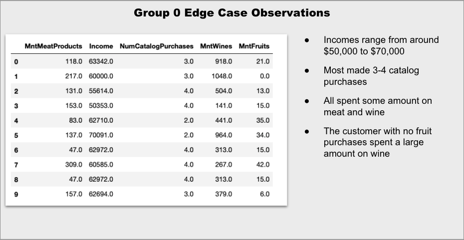
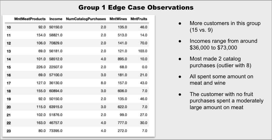
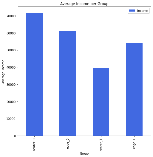
Indeed, it appears that the edge customers are more to each other than the two “center” customers, although it is still difficult to tell just by scanning the numbers. That’s easier to see with some quick graphs:
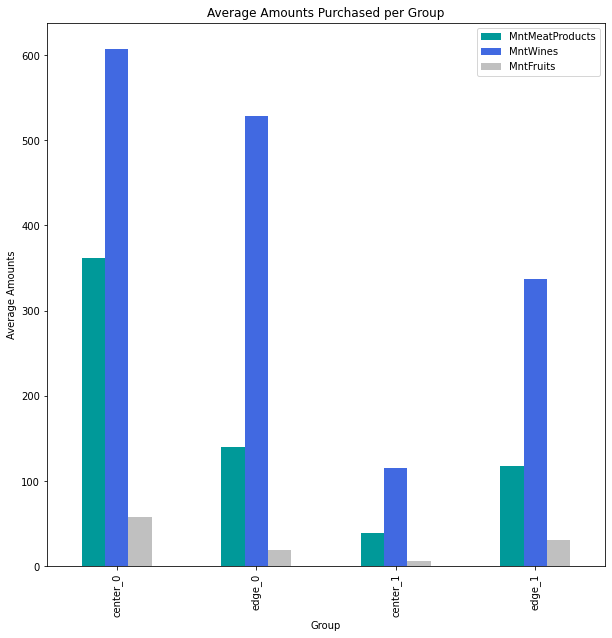
It is clear that the amount spent on wine is one of the distinguishing factors between the groups, as even the edge case for Group 0 is significantly higher than the edge case for Group 1. The amount spent on meat is much closer for the two edge cases.
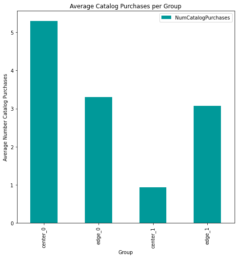
The differences in the number of catalog purchases are also quite similar for the edge groups.
Now that we’ve seen what makes an “average” customer and an “edge” customer for each group, let’s dig a little deeper into the statistics for each group to gain some insight that can help with a marketing plan.
One difference that immediately stood out to me was web behavior for the two groups. Group 1 tends to visit the website more.
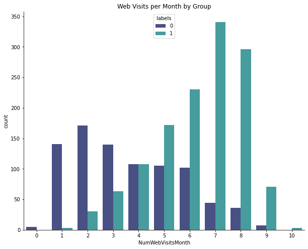
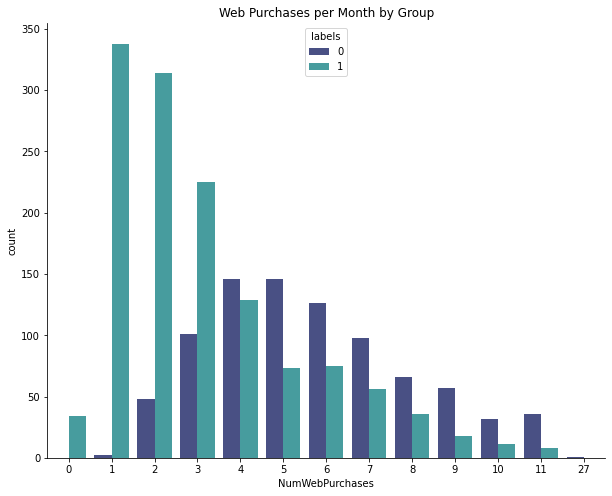
Lots of Group 1 customers have made 1-3 online purchases, but Group 0 is more likely to make multiple purchases. In other words, Group 1 are the browsers and Group 0 are the buyers.
Here is a summary of the more interesting findings. Any of the ranges are the interquartile range (middle 50%) for the group.
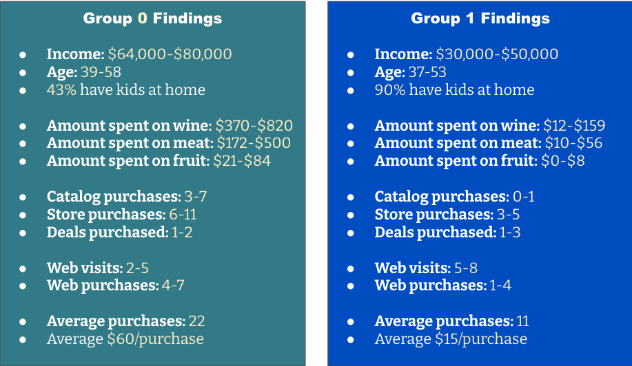
Group 0 is generally older, buys more frequently and spends more per purchase. They make frequent purchases from the storefront and also buy from the catalog and website. They do not seem overly concerned about price or deals.
For Group 0, organize a highlighted area in the store with meat, associated recipe ideas and a selection of wines that complement the meal. In the catalog, feature gift baskets or bundles that also pair meats and wines. Consider adding monthly subscriptions for meat and/or wine and promote them as gift ideas.
Group 1 is younger and is focused on child-rearing. They visit the website frequently, but make more purchases at the store. They are more value-focused.
For Group 1, capitalize on their website visits by suggesting lower-priced items and offering deals or promotions. Consider offering more kid-centric options and positioning adult items as a “date night” option. Ensure that there are plenty of budget wines available. Finally, consider a program to encourage repeated purchases.

Lesson of the Day
Like many learners, I started out seeing the topics as independent. Now, as I’m gaining more experience, I’m beginning to see the connections between concepts.

Frustration of the Day
I’m now about 80-85% through he bootcamp curriculum and I’m at the point where I have to make very deliberate decisions about where to focus. It’s frustrating because I want to learn it all and I want to learn it now.

Win of the Day
I’m finding that I’m much more deliberate in the decisions I’m making about feature engineering and selection.

Current Standing on the Imposter Syndrome Scale
3/5
Looked at job postings and felt good. Presented my non-technical in front of other students and about lost it. Work in progress:)
